Life planning mobile app
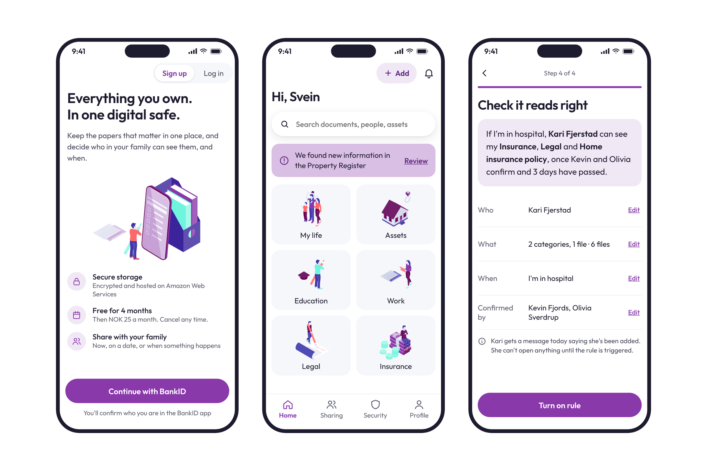
LifePlanner is a digital safe for the paperwork of life: insurance, property, legal documents and the details your family would need if something happened to you. After redesigning the web app, I took the same product to the phone.
I rebuilt every flow for mobile, designed the features the web didn't have yet, and set up a design system with clear rules for older users, working with the founders and in-house developers.
Outcomes
What changed because of the work.

+28%
sign-ups from the web onboarding redesign
+38%
user satisfaction on the web product
What I designed
The things I designed and shipped on this project.
- Four-step sign-up with BankID and payment built in
- Event- and date-triggered sharing of sensitive documents
- Legal document overview and personalised security tips
- Assets register with Property Register and Vehicle Register data
- My life: family members, life story and a timeline
- Documents, folders and photo albums
- A mobile design system built for older users
The brief
The problem, what I designed, and the result.
The web app was built for a desk. On a phone, long forms, a separate payment step and BankID in a browser window got in the way, and many users weren't confident with apps.
Rebuilt every flow for mobile: four-step sign-up with payment inside, event-triggered sharing, a legal overview, security tips, assets, My life and documents, on a design system with rules for older users.
The app launched with 58 screens across 10 flows on one shared design system. The web work it grew from lifted sign-ups 28% and user satisfaction 38%.
A safe people open at the hardest moments
The web app was built for a desk: long forms, a separate payment step and BankID in a browser window. But the moments LifePlanner matters most, like a hospital visit or a call from family, rarely happen at a laptop. Many of the people using it are older and not always confident with apps, so a phone version had to be simpler than the web, not just smaller.
Starting from a product people already trusted
I'd spent a long time inside LifePlanner's web app, so I didn't start from a blank page. I laid out every web screen flow by flow and asked one question of each: what does this ask of the person, and does that still make sense on a phone?
Some things carried over as they were. BankID stayed the front door, data from the Property Register still filled in what we could, and the purple, coral and mint brand and the isometric illustrations came with it. Other things had to go. A one-page form with a dozen fields is fine on a laptop. On a phone, it's a wall.
Like the web app, this was built with the founders and the in-house developers. A lot of the logic, especially around sharing and BankID, needed their input to get right, so design decisions stayed tied to what the team could actually build.
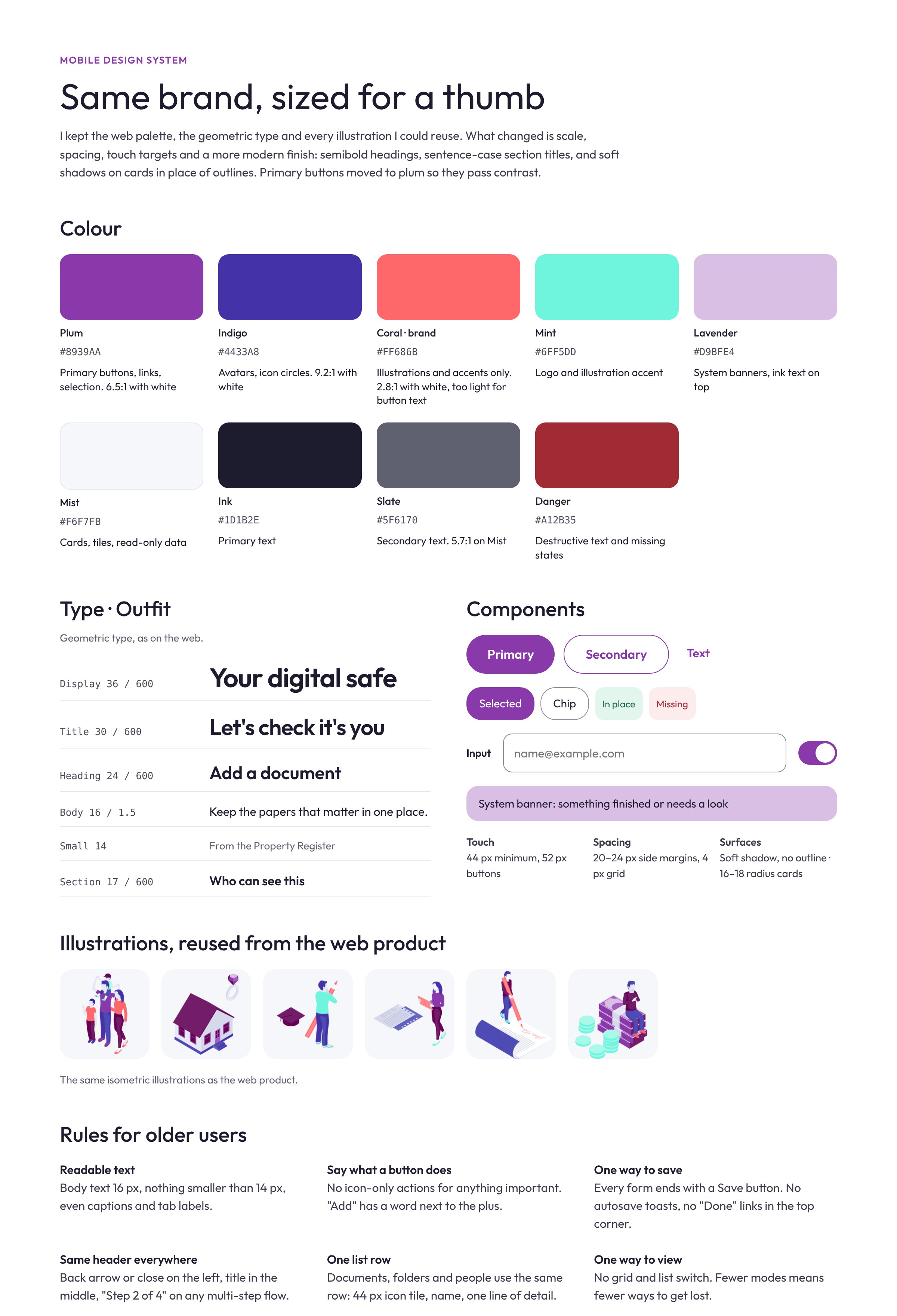
Rules for older users
A lot of the people who need a safe like this are planning for their family and aren't always confident with apps. That shaped almost every decision, so I wrote it down as a short set of rules the whole app follows.
- Body text is 16 px, and nothing is smaller than 14 px.
- Every important action has a word next to its icon. A plus on its own isn't enough.
- Every form ends with one Save button. No autosave toasts and no "Done" in a corner.
- Every screen has the same header, and every multi-step flow says "Step 2 of 4".
- Documents, folders and people all use the same list row.
- Tap targets are at least 44 px, and everything passes WCAG AA contrast.
That last rule changed the brand slightly. White text on LifePlanner's coral only reaches 2.8:1, so primary buttons moved to the brand's plum, which reaches 6.5:1. Coral stayed in the illustrations and accents.
Sign-up in four steps
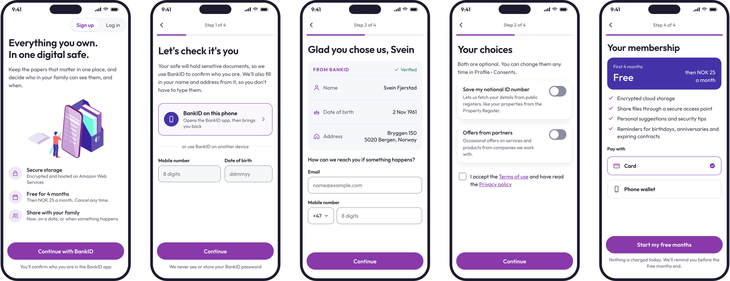
On the web, the biggest win had been putting payment inside sign-up rather than after it. I kept that and made each step do one job: confirm who you are with BankID, check the details we already know, choose what you consent to, and start your membership.
BankID gives us your name, birth date and address, so I showed those as a verified summary and only asked for an email and a phone number. Optional consents start switched off, and the progress bar says exactly where you are.
A home that points to what's new
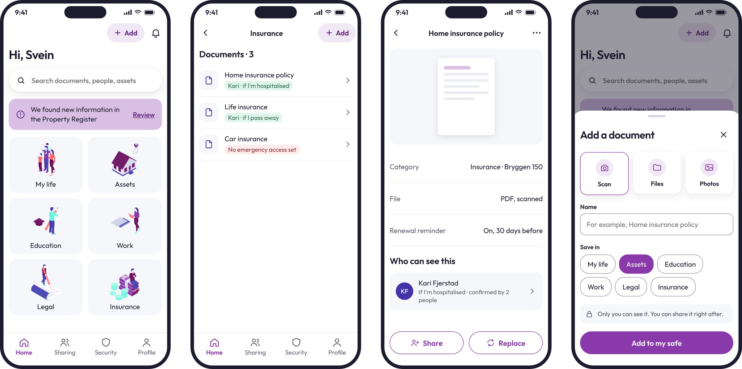
Home greets you by name and shows one thing to look at, like new information from the Property Register. Below it, your safe is split into the same categories as the web app: My life, Assets, Education, Work, Legal and Insurance.
Each category is a plain list. Every document row shows who can reach it and when, or says clearly that no one can in an emergency. Adding a document is one screen: scan, pick a file or a photo, name it, choose where it goes, and save.
Sharing that reads like a sentence
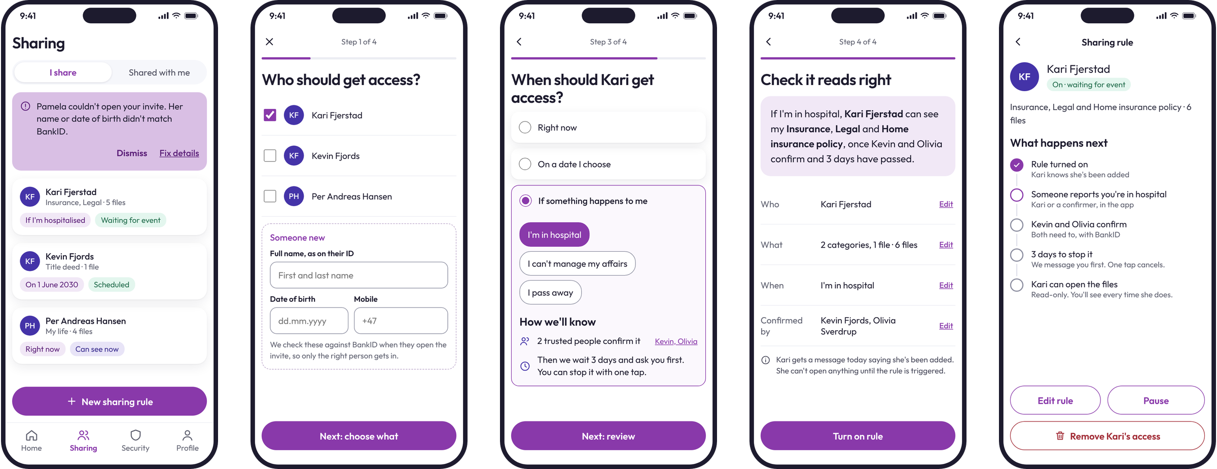
The feature people cared about most was sharing documents with someone at the right moment: now, on a date, or if something happens to them. It's conditional logic, and conditional logic is hard to trust when it's a set of switches.
So I split it into four questions: who, what, when, and a final review. The review writes the rule back in plain words: "If I'm in hospital, Kari can see my Insurance and Legal documents once Kevin and Olivia confirm and 3 days have passed." People can check it the way they'd explain it to their family.
Event-based access also needs a way to know the event really happened. I added trusted people who confirm it, plus a short wait during which the owner can stop it with one tap.
Guests, and when names don't match
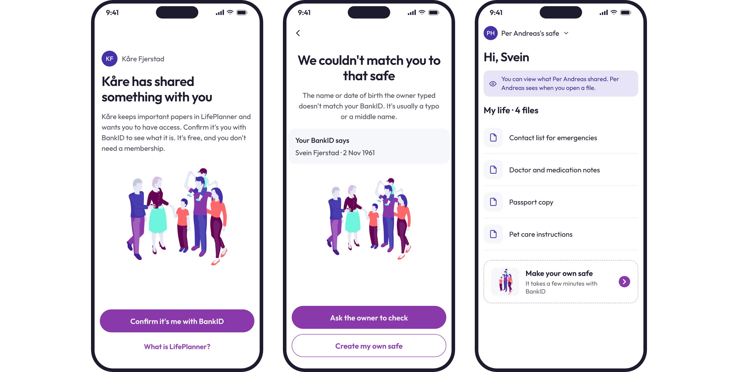
The people you share with often aren't LifePlanner members. They get an invite, confirm who they are with BankID, and see only what was shared with them, read-only.
On the web, a guest whose name or birth date didn't match the invite hit an error and a dead end. On mobile, the guest sees what their BankID says and can ask the owner to check with one tap. The owner gets a banner with a "Fix details" button.
Legal overview and security tips
Wills, powers of attorney, health wishes and who inherits what all depend on each other. The legal overview asks a few questions about your life, then shows what's in place, what's missing and what's optional. It's built to take to your legal advisor, not to replace them.
Security tips work the same way. They come from how your safe is actually set up, not from a generic checklist: a document with no emergency access, or someone's access you haven't looked at in over a year.

Edge states with a way forward
These are the screens people land on when something isn't the usual path. Each one says what's going on in a sentence and gives a clear next step, never a dead end. A guest with nothing shared yet can create their own safe. If we need a national ID number to fetch properties, you can confirm with BankID again or add the property yourself. Coming back, you unlock with the phone, with BankID as the fallback.

Everything you own, with values
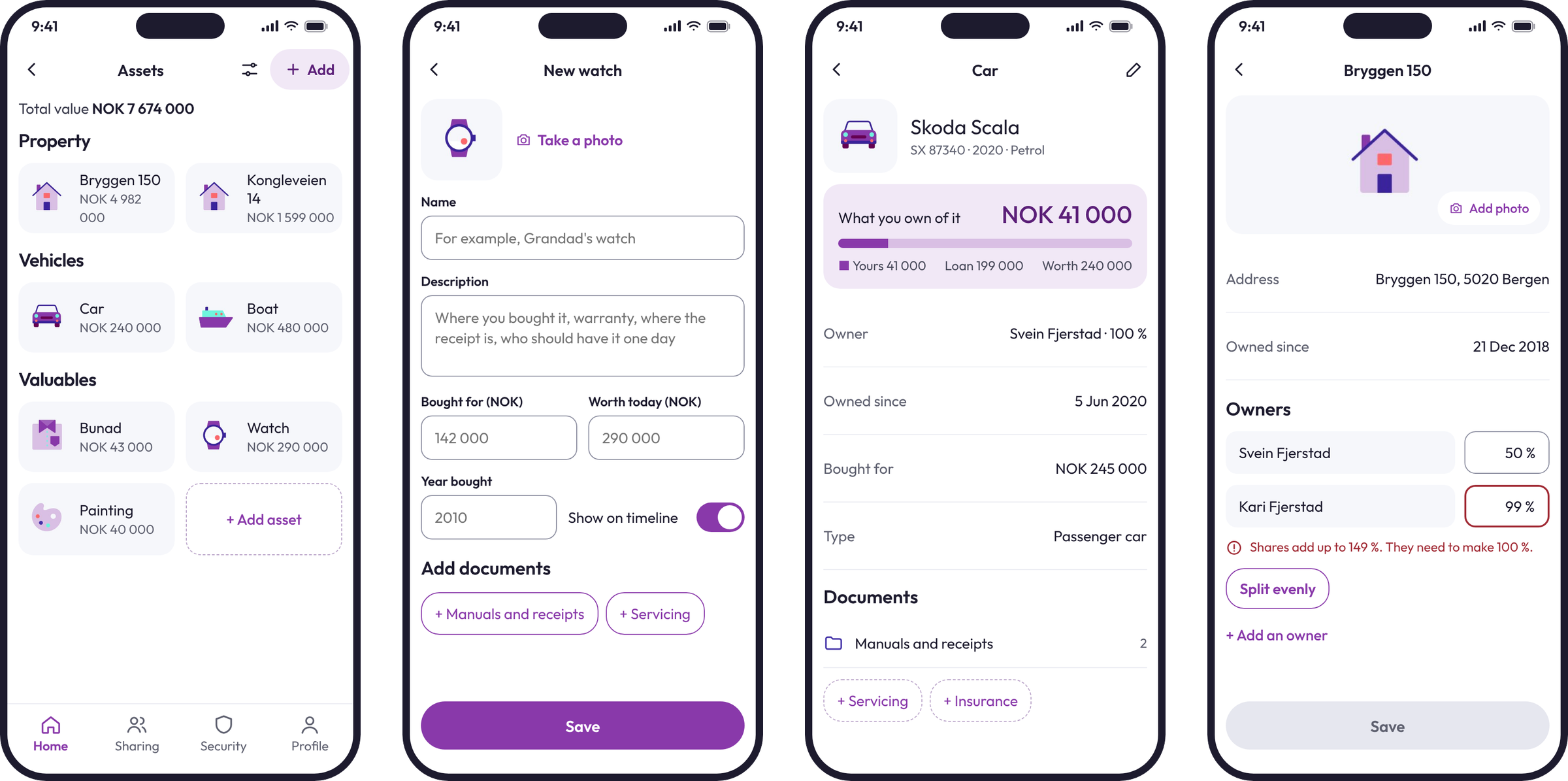
The assets register lists your home, car, boat and valuables, each with its value. For vehicles, it also shows how much of the car is really yours once the loan is taken off. A plate number fills in the car's details, and a check stops owner shares from adding up to more than 100%.
My life and a real timeline
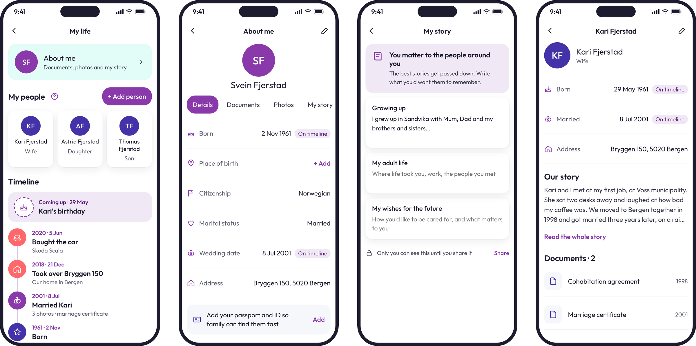
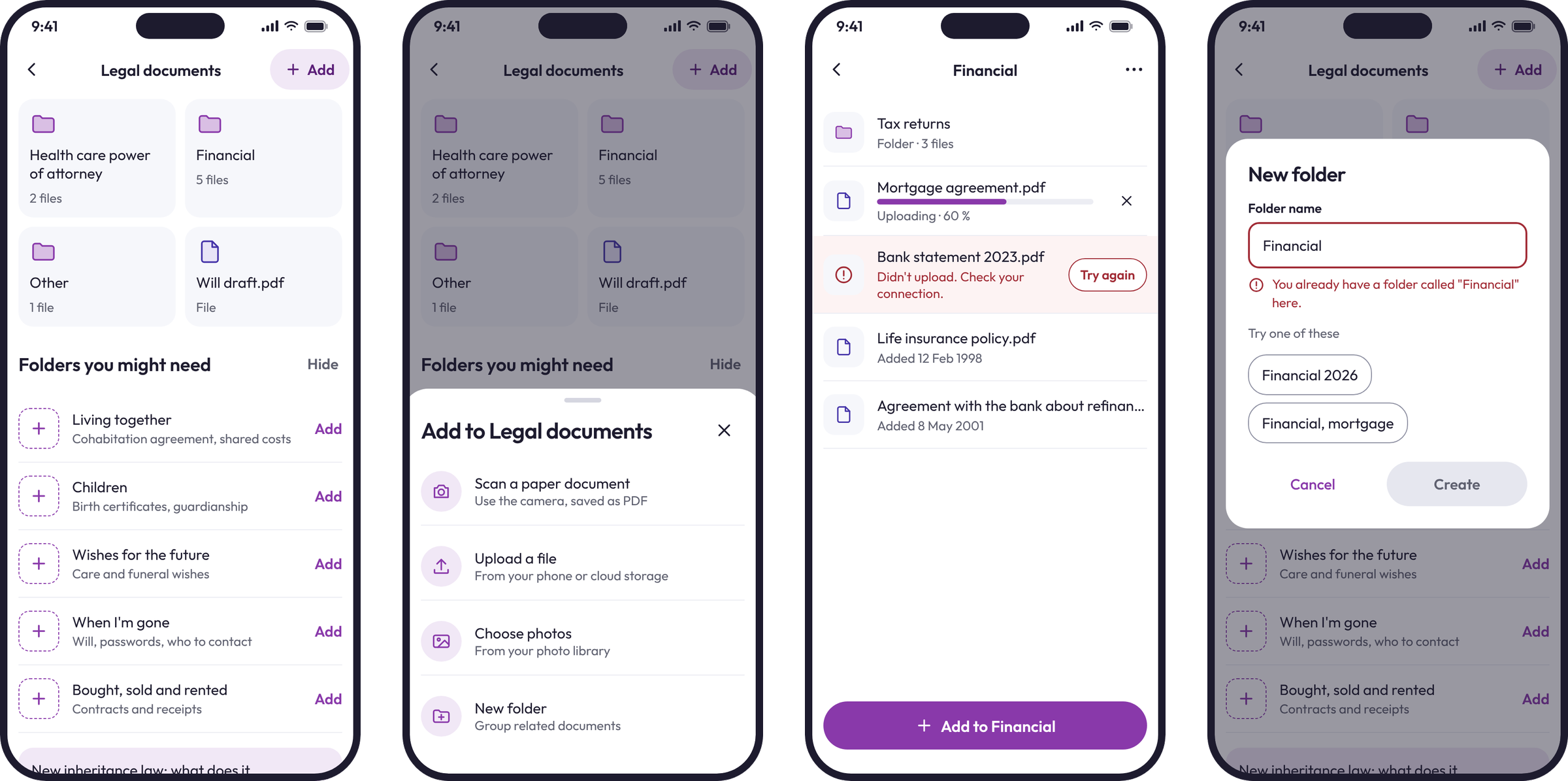
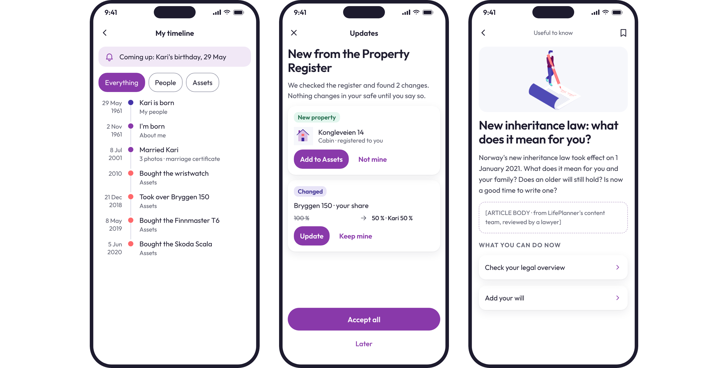
My life holds the people who matter, your own story, and a timeline. Almost every web form had a "show on my timeline" switch, but there was nowhere to see the timeline. On mobile it's a real screen, starting with what's coming up next.
Documents without the clutter
On a phone, the fastest way to add a paper document is to photograph it, so the camera scan comes first. Suggested folders like "When I'm gone" each say what goes in them, and the whole row is one tap.
Errors sit next to what caused them, with a way out: a failed upload has "Try again" on its own row, and a folder name that's already taken comes with suggested names to use instead.
Updates you approve first
The timeline gathers dates from across the safe in one place. When the Property Register changes, the app lists each change and nothing in your safe moves until you say so: add a new property, update your share, or say it isn't yours. "Useful to know" articles explain changes like a new law in plain words, then link to what you can do about it in your own safe.
One design system from the start
On the web, developers had been building screens slightly differently each time, not from carelessness but because there was no shared reference. For mobile, I set one up from the start: colours with their contrast ratios, type sizes, one list row, one header, one way to save, and the rules for older users.
It lived as a library the team used every day. New features went faster, and they looked like they belonged to the same app.
The result
The mobile app launched with 58 screens across 10 flows, all built on one shared design system. It grew out of the web work, where the onboarding redesign lifted sign-ups by 28% and user satisfaction by 38%. The mobile app carried the same approach to the phone: fewer steps, plain words, and a clear next action on every screen.
What I took from it: designing for people who aren't confident with apps makes the app better for everyone. Writing the rules down early, like one way to save and a word next to every icon, settled a lot of debates before they started.
What the team said
"Gytis worked with my startup, Lifeplanner, for over a year, focusing on product design, UX design and communication. He is extremely professional in what he does. He researched our industry, building a true understanding of the business, its customers, competitors and stakeholders. He is also open-minded and likable, a true team player who knows when to lean back and listen and when to challenge. We are very satisfied with our collaboration and with Gytis's deliveries."
More case studies





Book a 20-minute intro call
Slots show in your own time zone.
Let’s see if it’s a fit.
Twenty minutes is usually enough: the project or role, the product, and how your team works.


Ask AI about my work
AI answer, based on my case studies and CV
Answers show up here as they're written. I keep them short and point you to the case study they come from.
AI can get things wrong. If something matters, check the case study or email me at hi@gytismark.com.