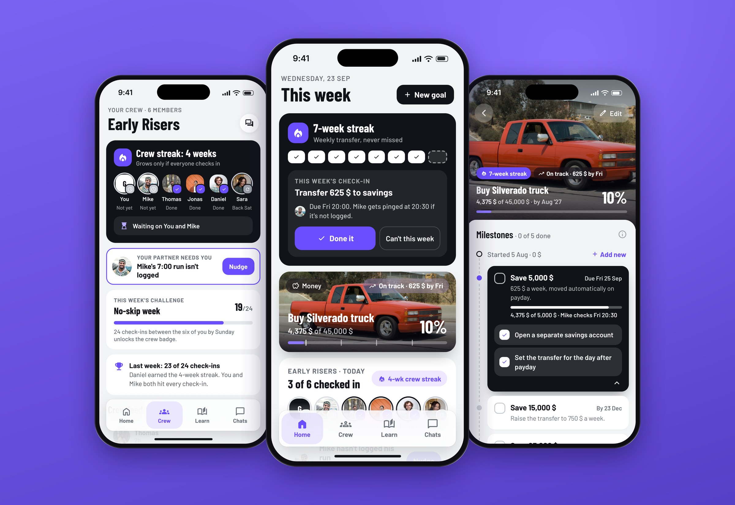
Swim coaching app proof of concept
An early-stage swim-tech startup came to me with an idea and a deadline. They wanted an app that tracks swims with a smartwatch, builds training plans, explains the few numbers that matter and lets you race friends in fair challenges. They needed a proof of concept that looked and felt like a real product, so they could use it to raise funds, and they needed it in two weeks.
The idea behind the product was simple: the coach lives on your wrist, so the phone can stay in the locker. My job was to make that idea concrete enough for an investor to understand in a few minutes, without cutting the corners that make a concept fall apart on the second look.
Outcomes
What changed because of the work.

What I designed
The things I designed and shipped on this project.
- Onboarding that ends on your first week of swims
- A Today tab that answers what to swim next
- Pre-filled workouts sent to the watch in one tap
- Training plans that adjust when you miss a swim
- Fair challenges with a Fastest / Improved leaderboard
- Open water setup with a safety check
- A standalone Apple Watch experience for the pool and open water
The brief
The problem, what I designed, and the result.
An early-stage startup needed a convincing proof of concept to raise funds, in two weeks. Swimmers want structure, but the apps they use track plenty of numbers and explain almost none of them.
Interviewed swimmers, tested the top five swimming apps, built three personas and designed the full iPhone and Apple Watch product, then reviewed it against the research before the handoff.
Delivered in two weeks: 55 screens covering onboarding, workouts, training plans, fair challenges, open water safety and the watch, plus the settings, error and empty states. The client took it into their fundraising.
The brief: swim more, think less about how
The swimmers the client wanted to reach want structure and variety, but writing a good session takes time and coaching knowledge most of them don't have. The apps they use track plenty of numbers and explain almost none of them.
So the brief was simple. Give swimmers a reason to show up, a session worth doing when they get there, and a clear sign that it's working. The watch tracks the swim and gives feedback on the metrics that matter. The phone is for the detailed view, training plans and challenges you share with friends.
Research: seeing the problem from up close
Two weeks doesn't leave much room, but skipping research is how a proof of concept ends up proving the wrong thing. I interviewed swimmers and asked them to walk me through their regular training routines, with real examples of the methods and tools they use. I noted down 11 breakdowns, and five of them came up for every participant in every scenario. I also tested the top five swimming apps hands-on and read through App Store and Play Store reviews to see what excites people and what annoys them.
The five breakdowns everyone shared:
- Interfaces are full of useless data.
- There are only a few essential metrics that swimmers care about.
- It's hard to create custom training plans without a personal coach.
- It's hard to compare results between friends because they're always doing different workouts.
- It takes a lot of time to come up with new exercises that are interesting and useful.
Three swimmers, one primary
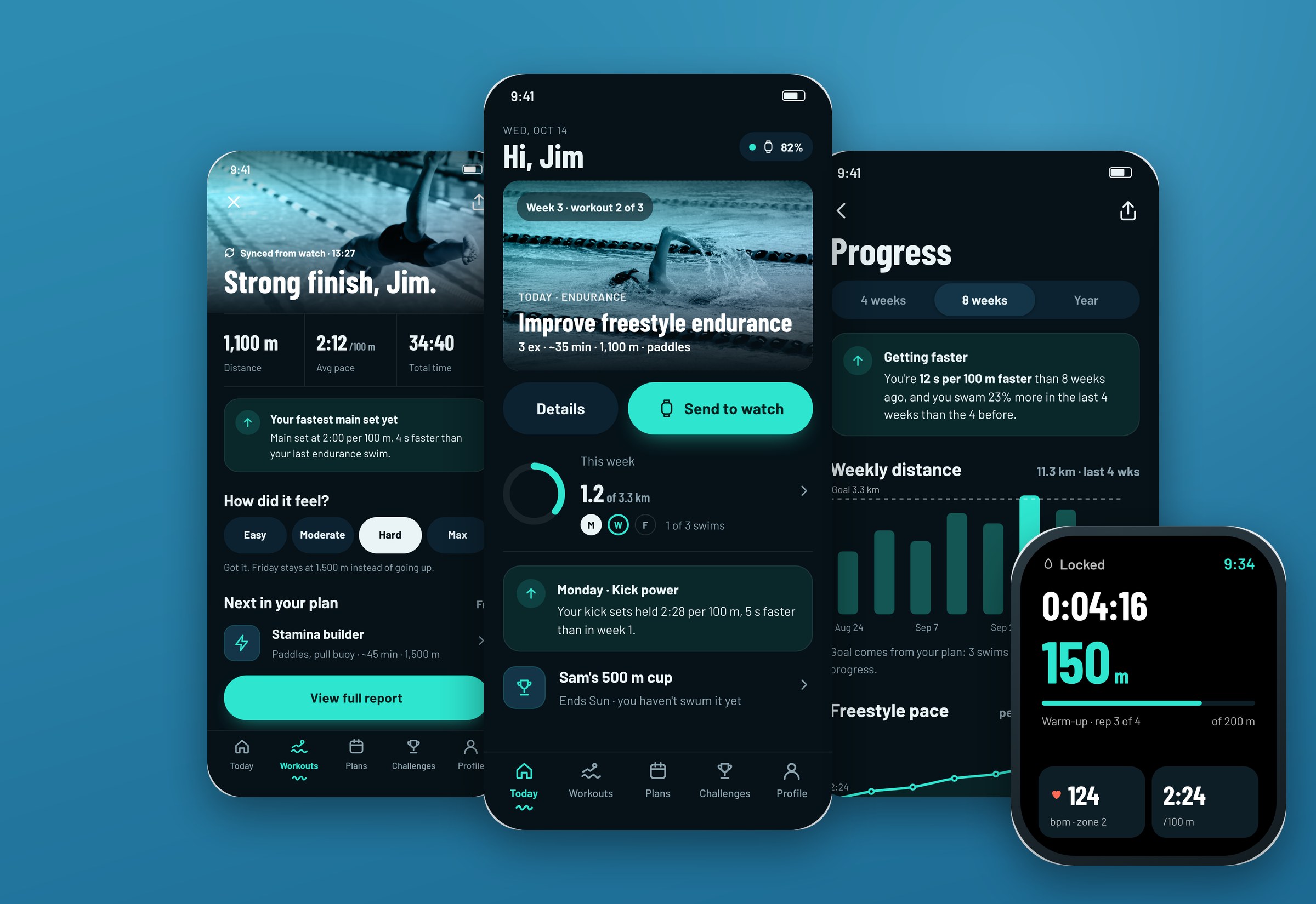
I built three personas from the interviews, one per level. Jim, the intermediate swimmer, overlapped the most with the other two, so I made him the primary persona. If a screen works for Jim, it usually works for Tommy (the beginner) with a bit more guidance and for Tifany (the advanced triathlete) with a bit more data.
Jim's scenario shaped the whole flow: he finds the app, tries a few workouts, sets a goal and a plan, then invites two college friends to a challenge and they race each other through their swims. It also gave the client a story they could walk investors through from start to finish.
Two weeks, one pass at each step
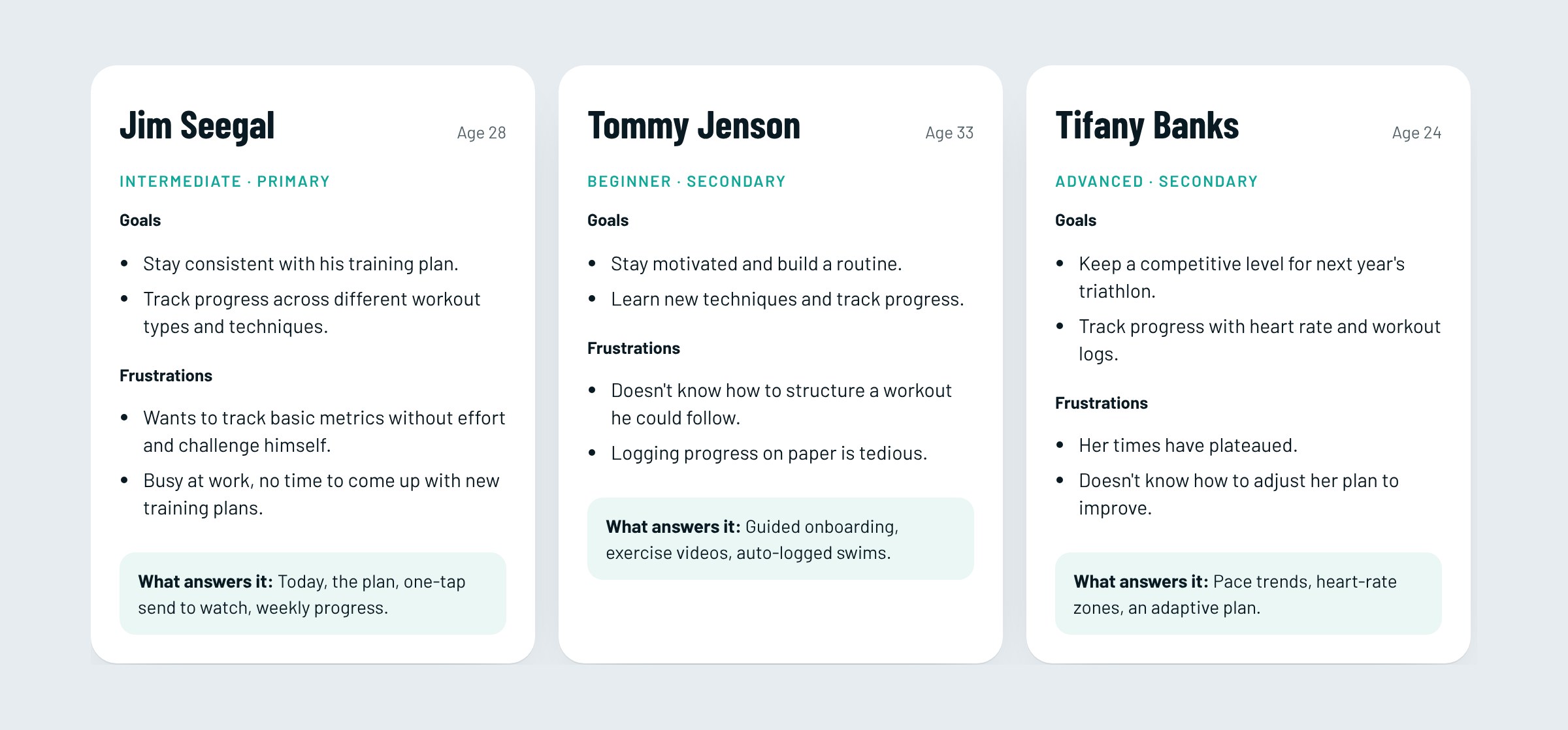
With a short timeline, the order of work matters more than the speed. I sketched every screen on paper first and went through a few rounds with a user until the main usability issues were gone. Then I moved to low-fi screens in Adobe XD, and only then did the visual design. Changing a sketch takes minutes. Changing a polished screen takes hours, and there weren't hours to spare.
Before the handoff I added a step I'd skip on a fast project and regret later: a proper review of the whole prototype against the research. It turned up a ranked list of issues, numbers that didn't add up and states that were missing. Everything in the flows below addresses that list.
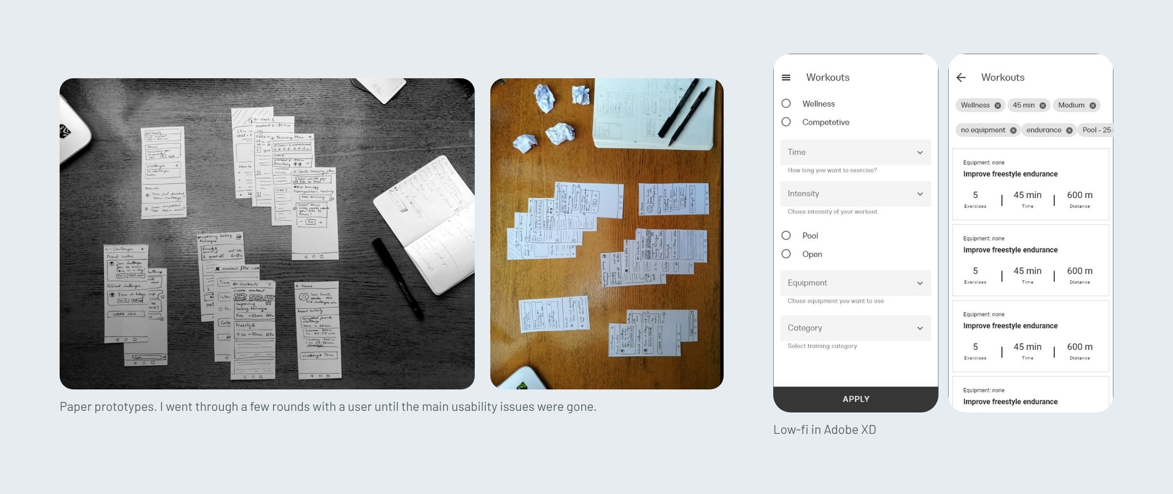
The biggest decision was the home screen. It's tempting to make the profile the home, but a profile full of lifetime totals doesn't tell you what to swim today or whether you're getting better. So I split the app into five tabs with one job each, and put a Today tab first.

Five rules I checked every screen against
These came straight from the breakdowns and the personas. When a screen got crowded or a decision felt like a coin toss, I went back to this list. On a two-week project, that saved more time than anything else.
- Leave the phone in the locker. Plans, workouts and challenges go to the watch with one tap, and the watch runs the swim on its own.
- Few metrics, explained. Every result leads with one plain sentence, then three numbers, then the rest.
- The plan bends, it doesn't break. A missed swim gets a new day, a shorter version or a skip, and the week adjusts.
- Compare fairly. Friends race on the same task, and an "Improved" board lets a beginner beat a faster friend.
- Safety before stats in open water. Say who gets alerted, when and how, before the swim starts.
Deep water, one bright accent
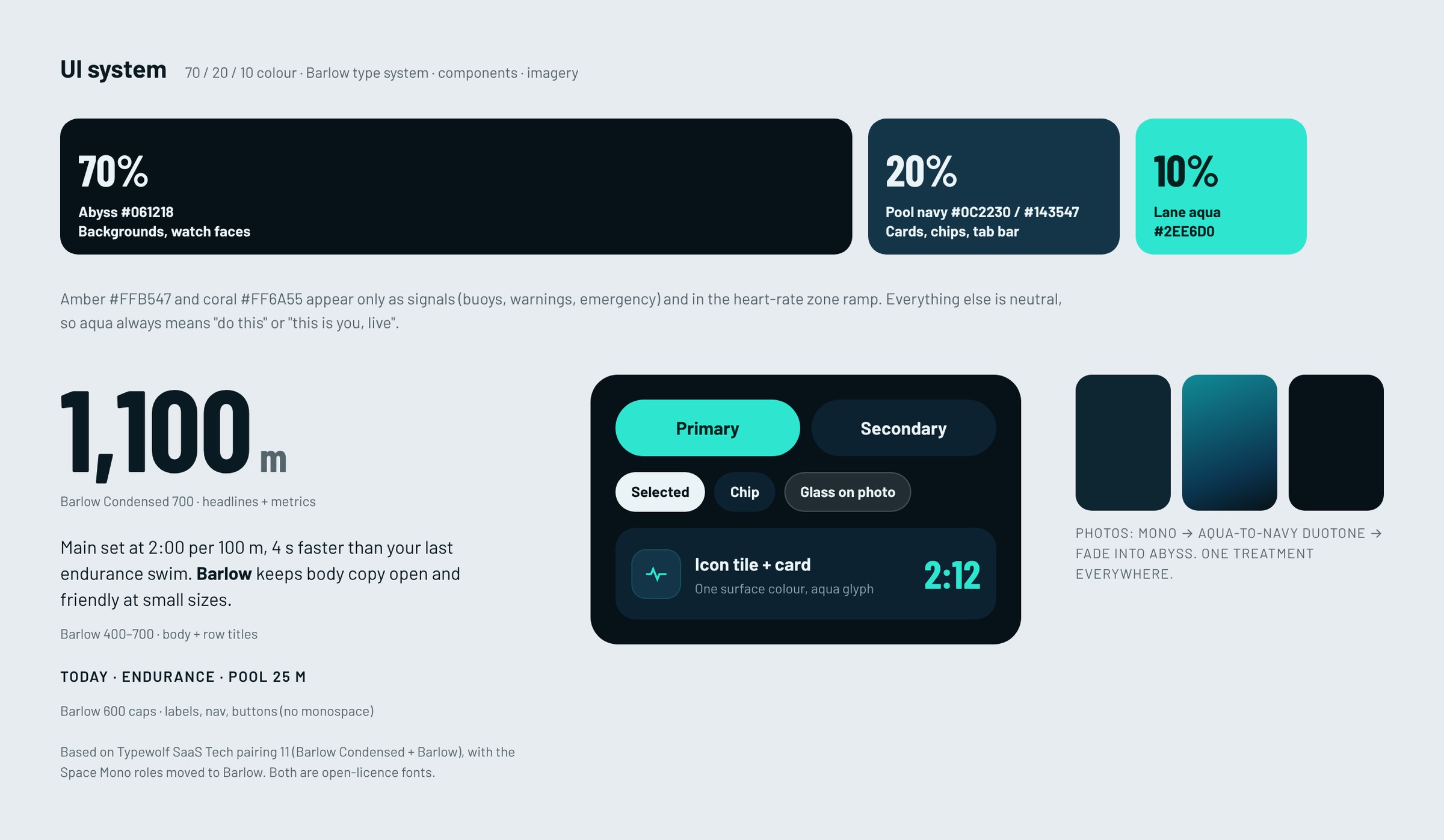
Swimming apps live in two places: a bright pool deck and a dark watch face. I went with a dark "deep water" theme so the phone and the watch feel like one product, and kept a strict 70/20/10 colour split. Abyss navy is the background, pool navy is for cards and controls, and lane aqua only appears when something is yours, live, or the next thing to tap. Amber and coral are kept for signals like buoys, warnings and emergencies.
For type I used Barlow Condensed for headlines and every metric, and Barlow for everything else. Condensed numbers are what you expect from a sports product, and they fit big paces and times on a small watch screen.
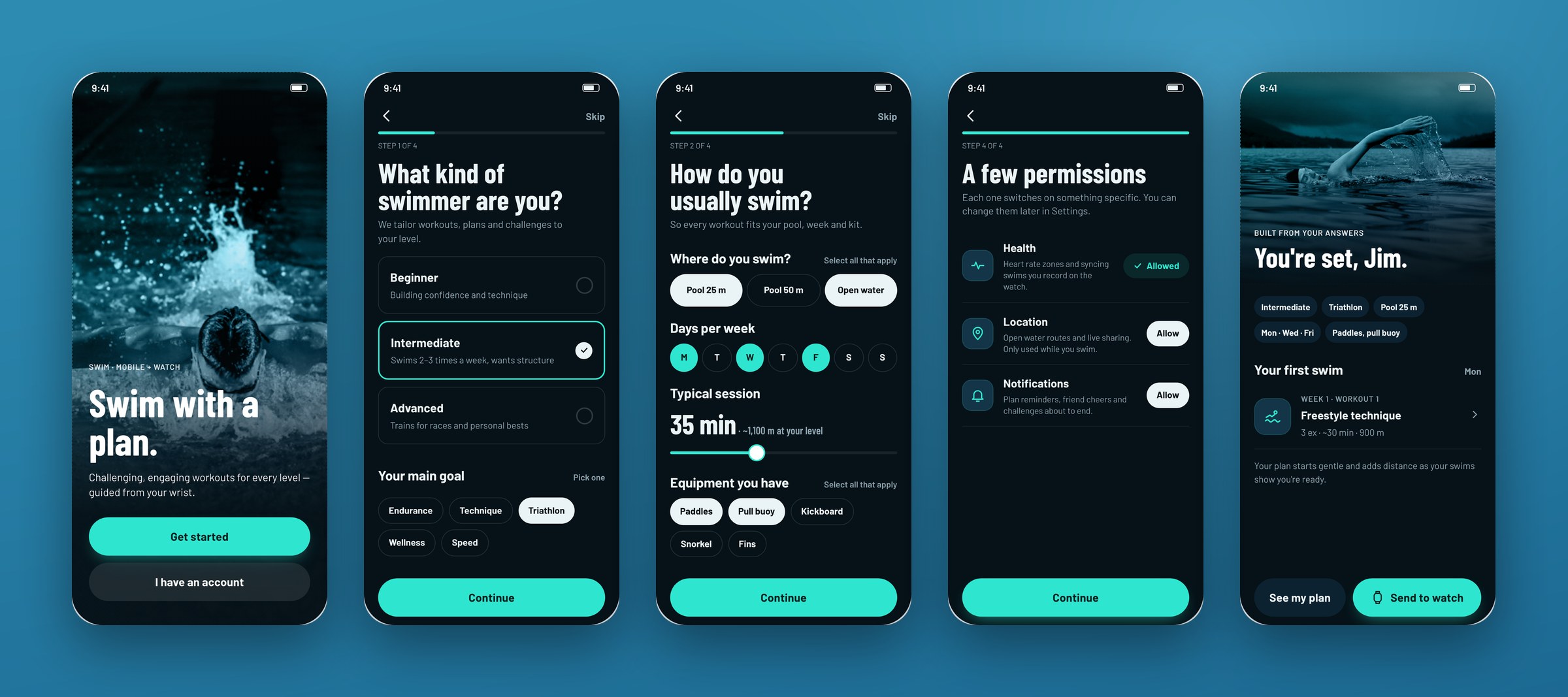
Onboarding that ends on your first week
Generic workouts ignore your pool, your kit and your week, and a beginner like Tommy doesn't know how to structure a session at all. Onboarding is four short steps, and every question changes something you get. Level, goal, swim days and session length pick the plan template, the equipment you have filters the exercise library, and pool length sets lap counting on the watch. Permissions come with a one-line reason each. It ends on your first week of swims, not an empty home screen.
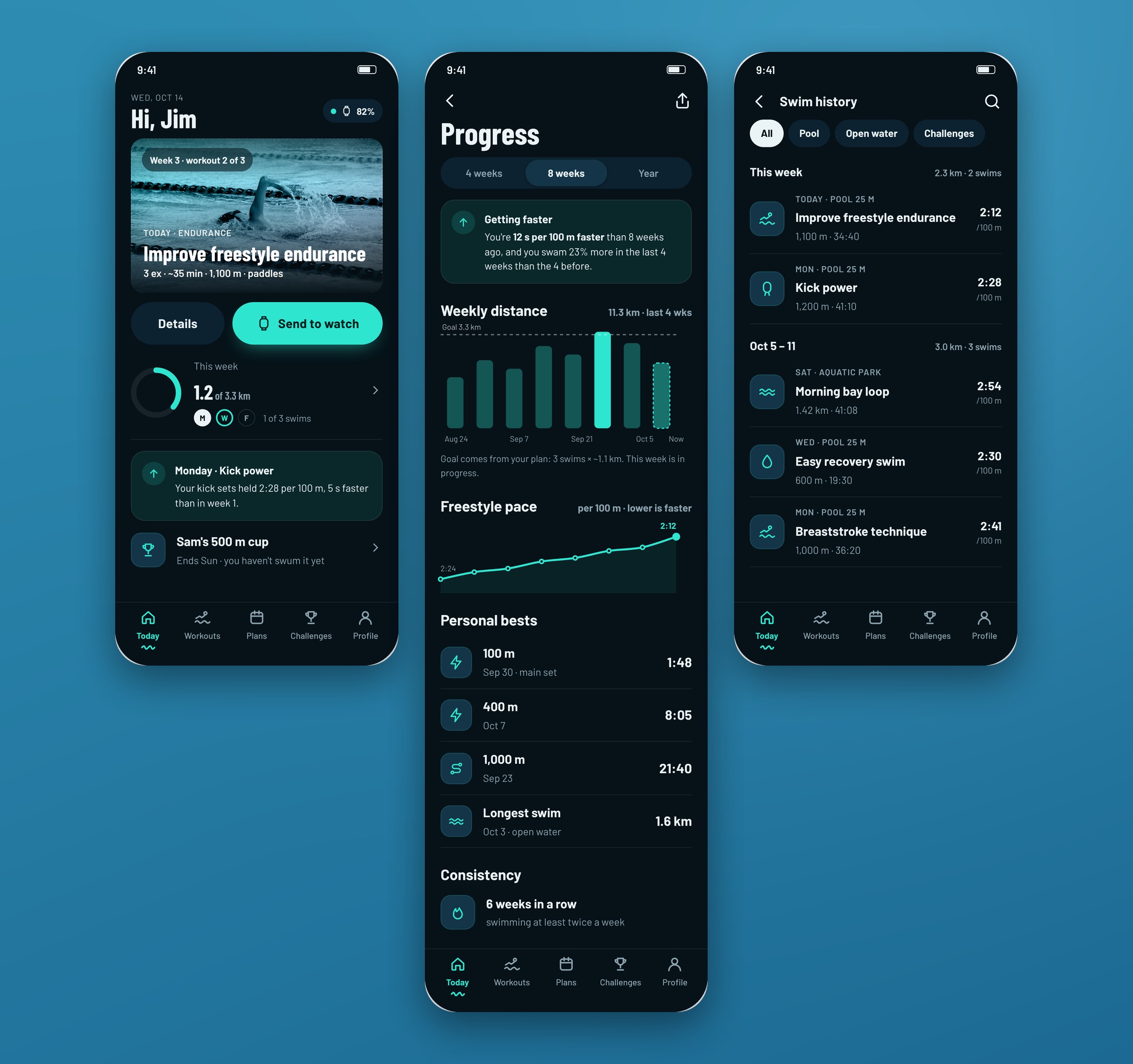
A home that answers "what do I swim next?"
The Today tab answers two questions all three personas had: what should I swim next, and am I getting better? Today shows the next session with a one-tap send to the watch, this week's progress against the plan and one insight from the last swim. Progress shows 8 weeks against the plan's goal, plus personal bests and a streak. History groups swims by week, so gaps are easy to spot.
A proof of concept goes in front of people who look closely, so the numbers had to hold up. The weekly goal comes from the plan (3 swims × about 1.1 km = 3.3 km), and the pace trend only uses freestyle sets so kick days don't skew it.
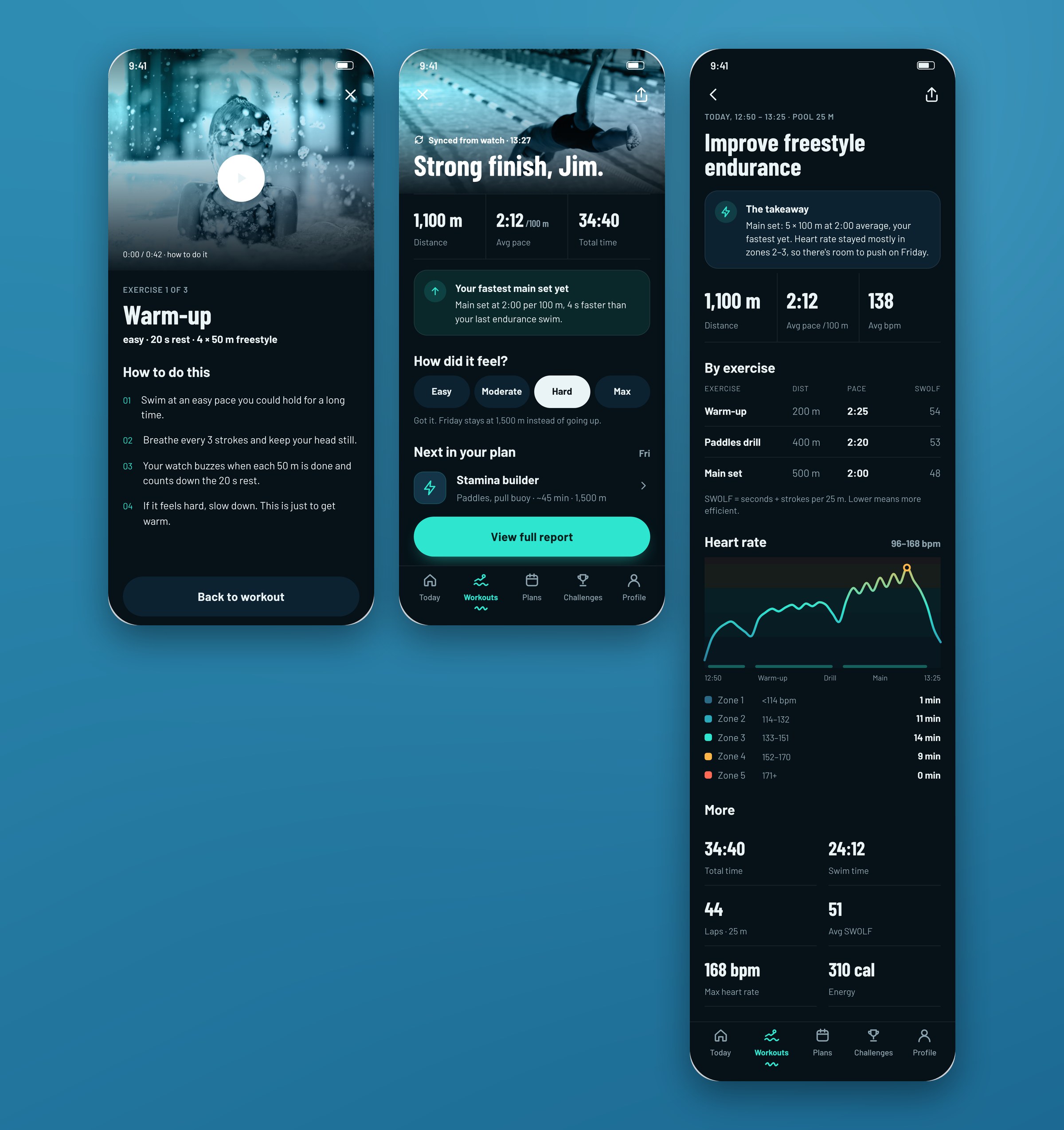
Workouts: pre-filled, sent to the watch, explained afterwards
Jim has no time to invent sessions. The workout builder is pre-filled from onboarding, so Generate works with zero taps. Send to watch is the main action, and manual logging moved to a menu.
After the swim, the result leads with one sentence before any number: "Your fastest main set yet. Main set at 2:00 per 100 m, 4 s faster than your last endurance swim." Then three numbers, then everything else. A "How did it feel?" question sets the next session: hard holds the volume, easy adds 100–200 m.
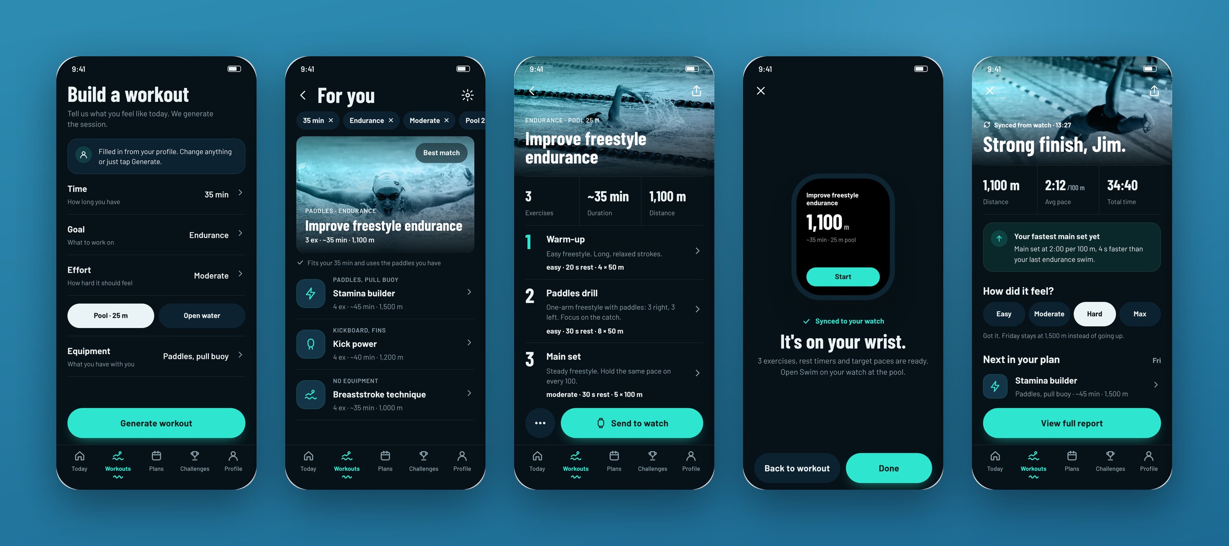
The full report keeps the detail for people like Tifany who want it: per-exercise pace and SWOLF (with a one-line explanation of what SWOLF means), heart-rate zones and the rest of the stats.
Training plans that bend instead of break
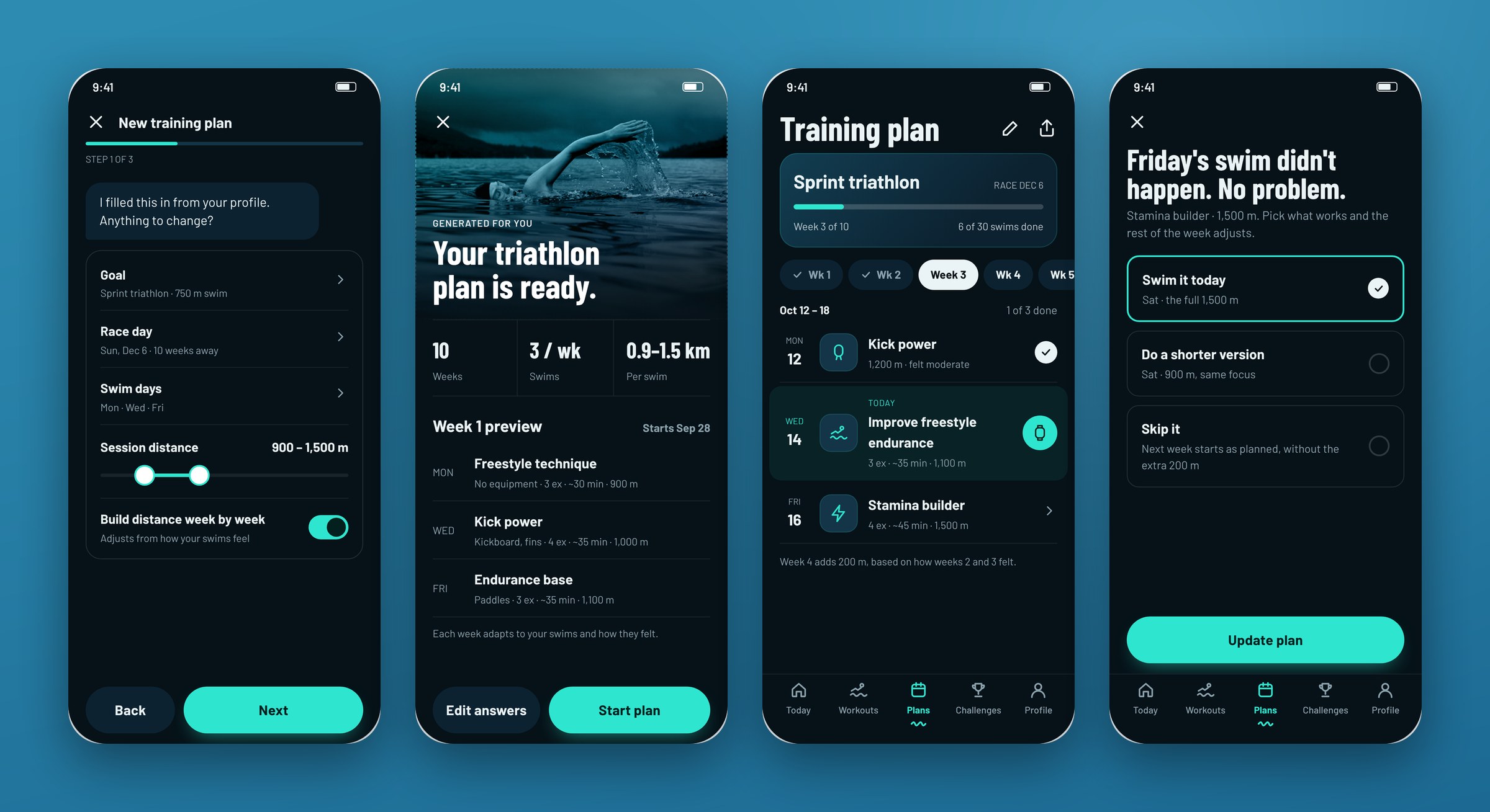
Building a plan without a coach is hard, and Tifany didn't know how to adjust hers when her times plateaued. The plan bot pre-fills from your profile and only asks what's new. Plan length comes from the race date, weeks have real dates and today is highlighted. Distance only goes up when last week felt moderate or easier.
When life gets in the way, a missed swim gets three clear options instead of a red mark: swim it today, do a shorter version or skip it. The rest of the week adjusts, and two hard sessions never land on back-to-back days after a reschedule.
Challenges that are fair to everyone
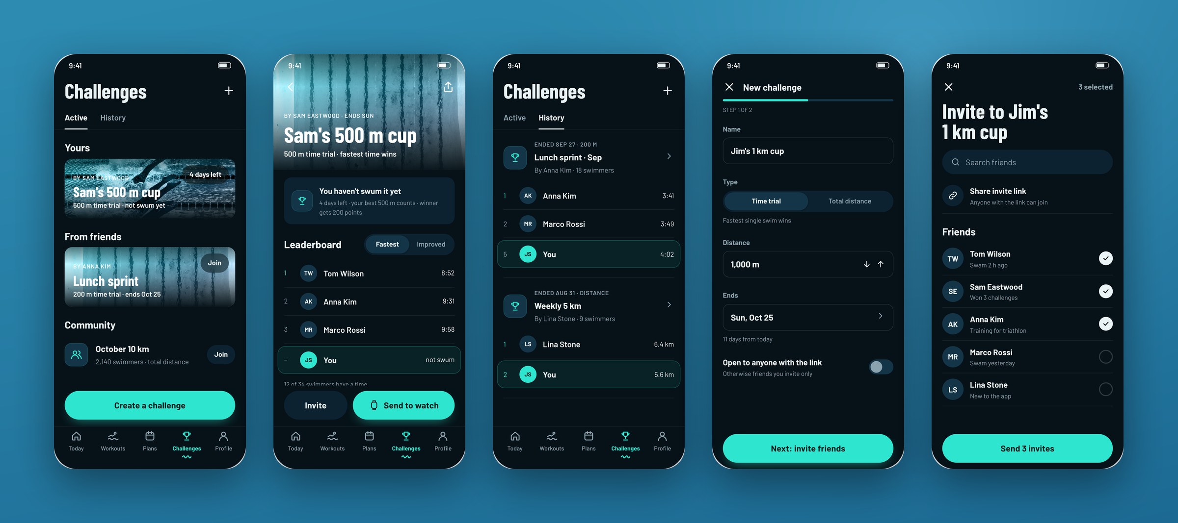
Friends rarely do the same workout, so comparing results is meaningless. That was one of the five breakdowns everyone shared. Every challenge is one shared task, like a 500 m time trial or a total distance. A Fastest / Improved switch on the leaderboard lets beginners win too, because "Improved" measures your gain over your own best from the last 60 days. Your own row is always visible, and if you haven't swum yet, it says "not swum" instead of showing a fake rank.
Profile and friends
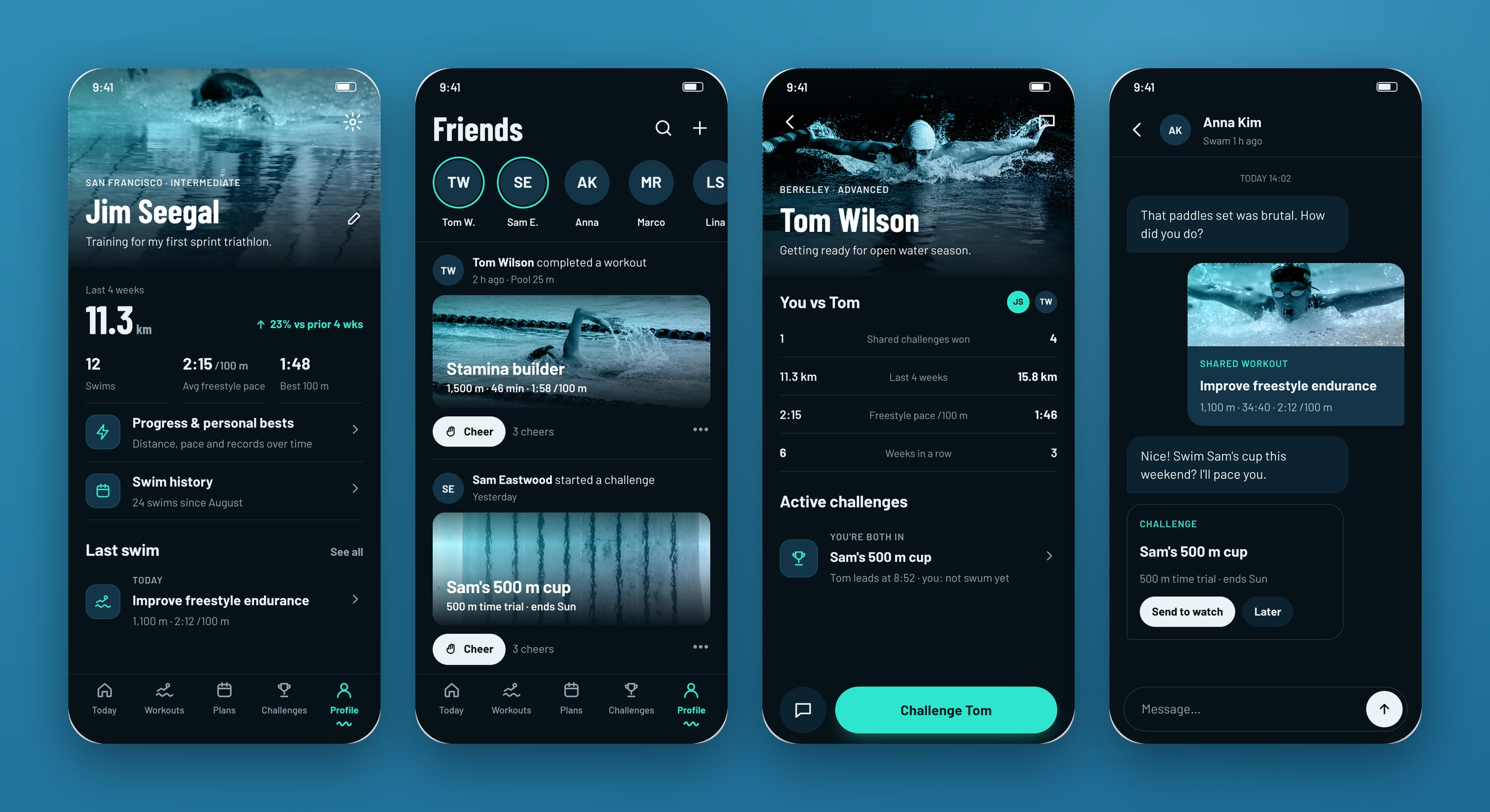
Jim wants to share what he does, but social features shouldn't make slower swimmers feel bad. Your profile leads with a 4-week trend, not lifetime totals. Friend profiles show you-vs-them only on challenges you both joined. Cheer is the default action, and Challenge and Message sit in a menu.
Open water: safety before stats
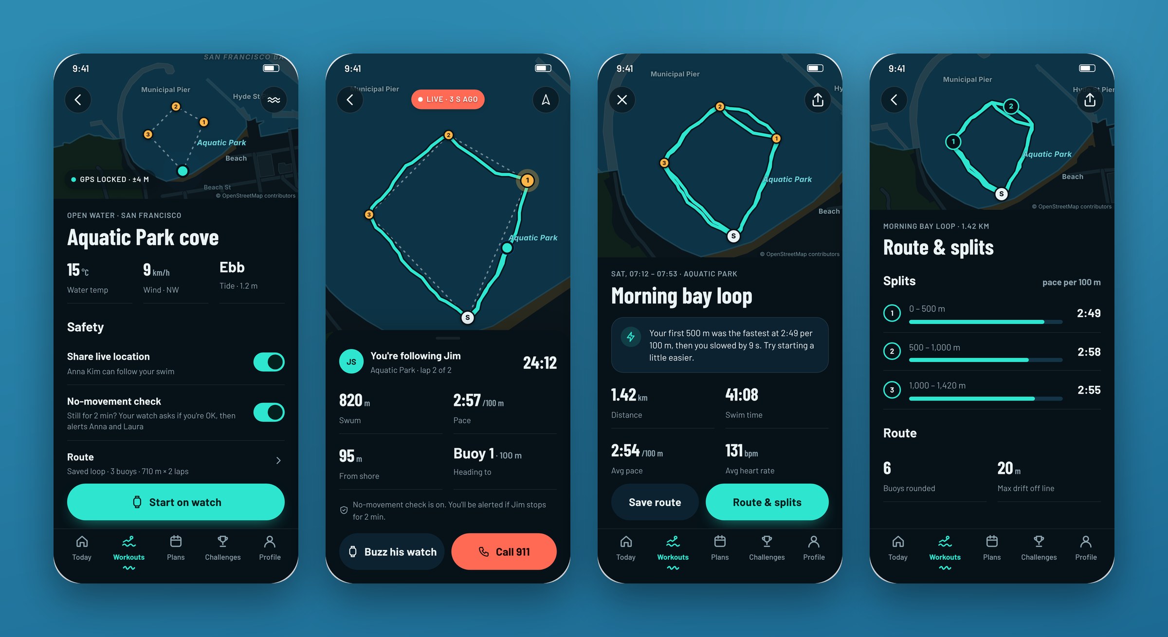
Open water is where swimmers feel least safe, and where pool metrics stop working. The setup screen shows a real map of the venue and says exactly who gets alerted and when: if you're still for 2 minutes, the watch asks "Are you OK?", and 30 seconds later it alerts your contacts. A separate view lets the friend on shore follow the swim live. Afterwards you get splits every 500 m and how far you drifted from the planned buoy line.
The watch does the work in the water
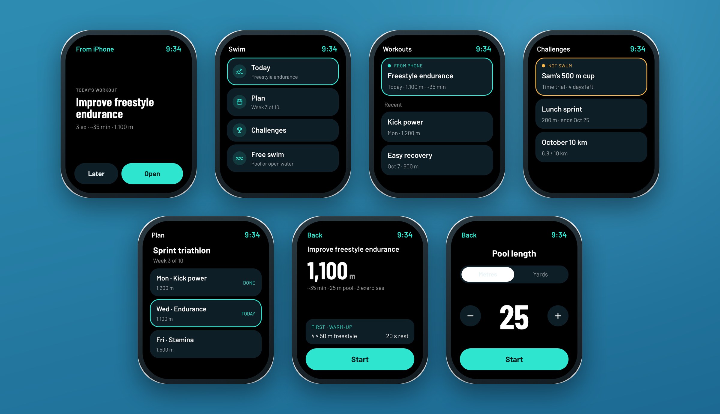
The phone stays in the locker, so the watch has to stand on its own from the first tap. Today's workout sits first on the watch home, and recent workouts show the day and distance so they're easy to tell apart. The last few workouts are stored on the watch for offline use.
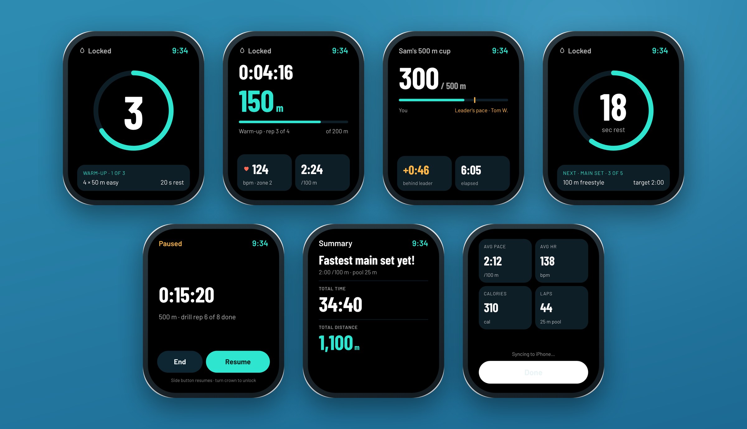
In the water you have wet fingers, a locked screen and a glance mid-length. Every watch screen has big condensed numbers and one clear hierarchy. Pause and end use the side button, not touch. The rest screen previews the next set and its target pace, and challenge mode shows how far you are from the leader's pace at the same distance.
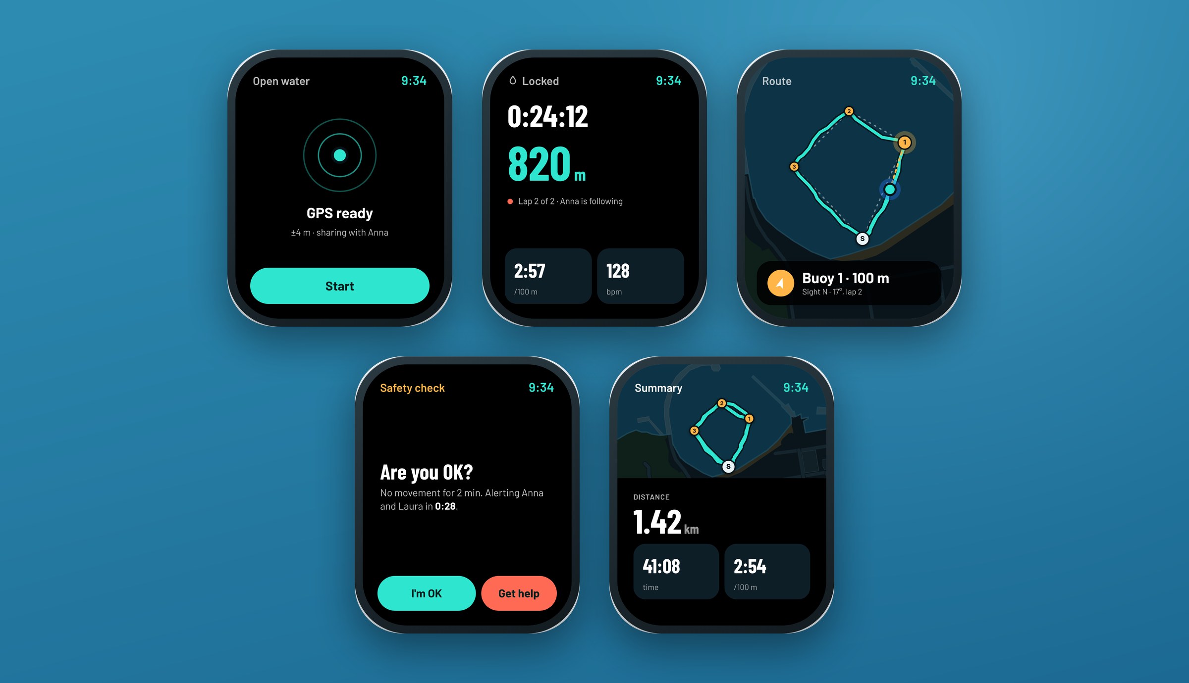
In open water, an arrow points to the next buoy with the bearing to sight on, and the safety check gives you a countdown before anyone is alerted.
The states that make it believable
Proof-of-concept work usually skips the states people hit first: no permission, no watch, no friends yet. Anyone who's built an app notices when they're missing, and investors are often those people. I added settings, error and empty states. Errors say what happened and what to do next, and a workout that can't reach the watch is queued and sent as soon as it reconnects. Empty states explain why the feature is worth it.
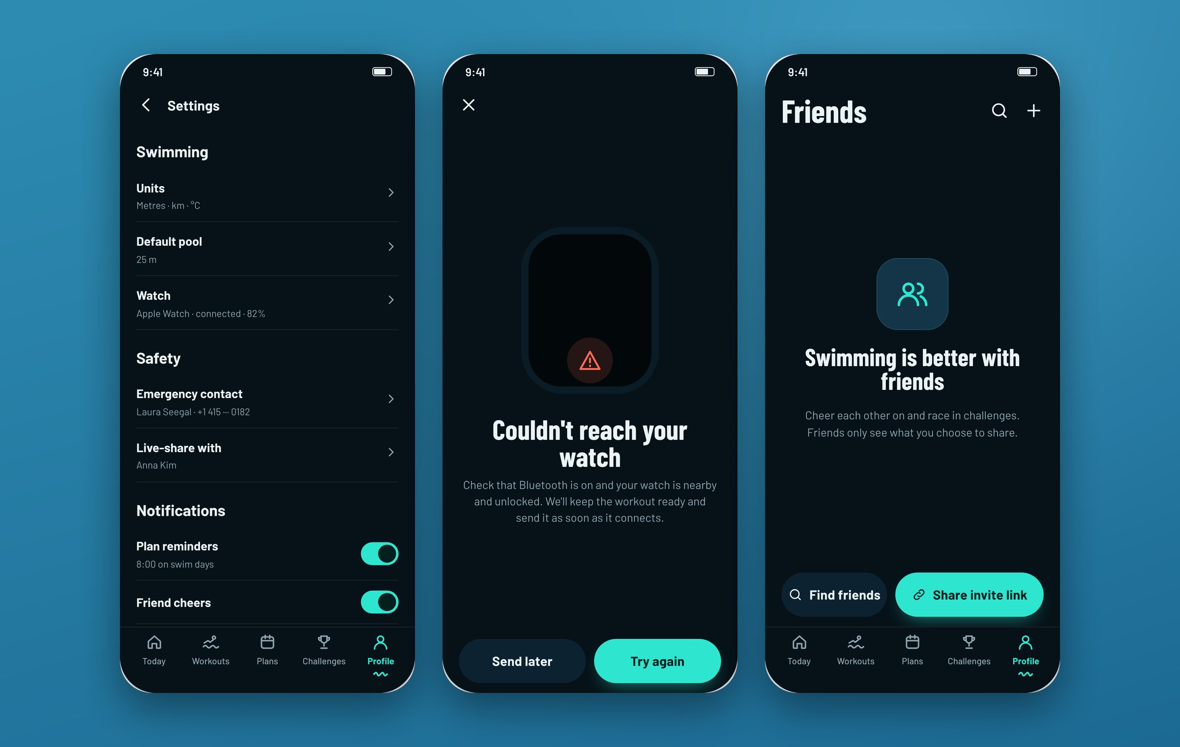
The result: a fundable story in two weeks
In two weeks the client got a complete proof of concept: 55 screens across iPhone and Apple Watch, covering onboarding, workouts, training plans, fair challenges, open water safety and the watch, plus the settings, error and empty states. I delivered it to the client to use in their fundraising.
It isn't a launched product, so there are no usage numbers yet. If the project moves forward, these are the first things I'd put in front of swimmers:
- Can a first-time user send a workout to the watch within 2 minutes of opening the app?
- Do people understand the takeaway sentence without looking at the numbers?
- Does the "Improved" leaderboard keep slower swimmers in challenges?
- Do people trust the no-movement check enough to switch it on?
Once it's live, I'd watch four numbers: week-4 retention, plan adherence (planned swims completed or rescheduled, not skipped), how many swims start from a pushed workout instead of a blank free swim, and how many invited friends post a result before the deadline.
This project reminded me of something I tell clients all the time: a clean UI isn't the same as a clear product. A proof of concept has to look finished, but it also has to make sense when someone asks "why does this number say that?" Spending part of the two weeks on research and a review, instead of more screens, is what made it hold up.
What the team said
More case studies




Book a 20-minute intro call
Slots show in your own time zone.
Let’s see if it’s a fit.
Twenty minutes is usually enough: the role, the product, and how your team works.


Ask AI about my work
AI answer, based on my case studies and CV
Answers show up here as they're written. I keep them short and point you to the case study they come from.
AI can get things wrong. If something matters, check the case study or email me at hi@gytismark.com.