Why are users not getting value from all the data we're showing them?
How data-heavy products confuse activity with insight — and what to do instead

Most data-heavy products get the same thing wrong: they try to show as much as possible instead of figuring out what people actually need.
The two failure modes
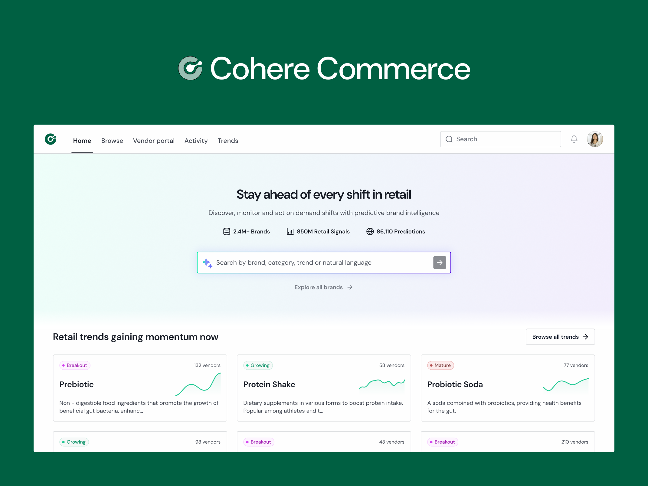
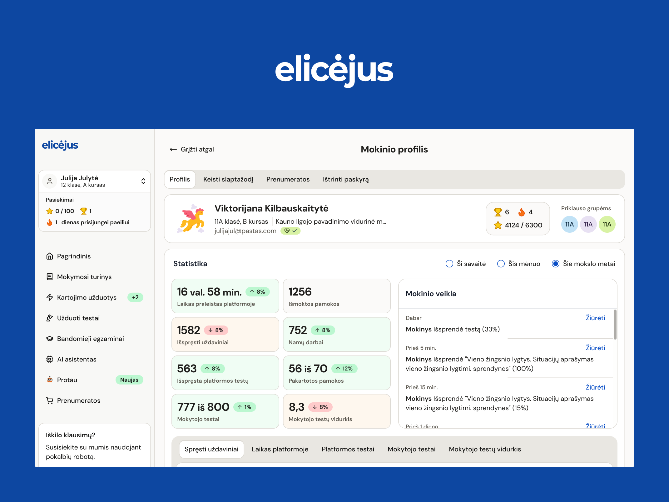
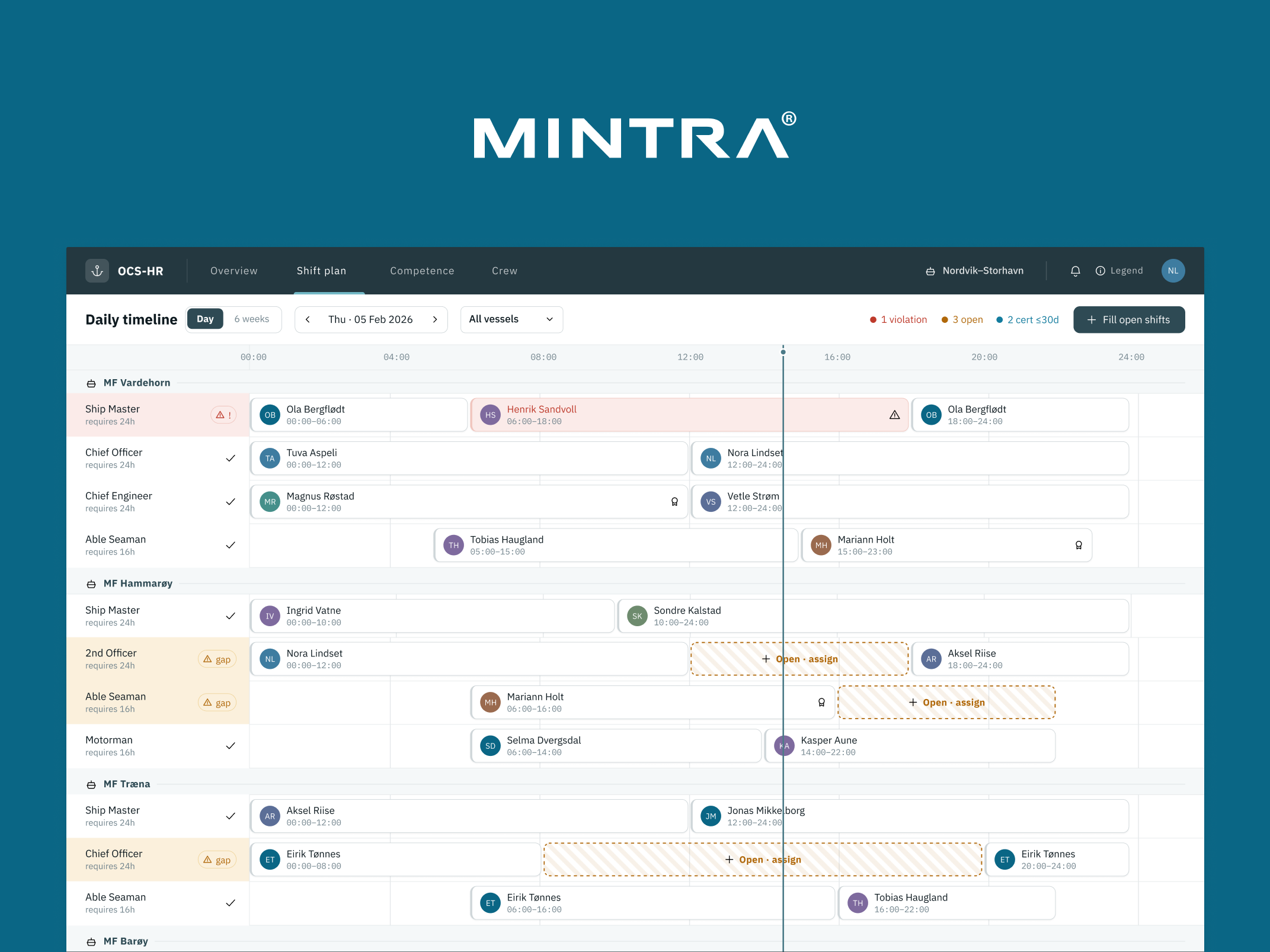
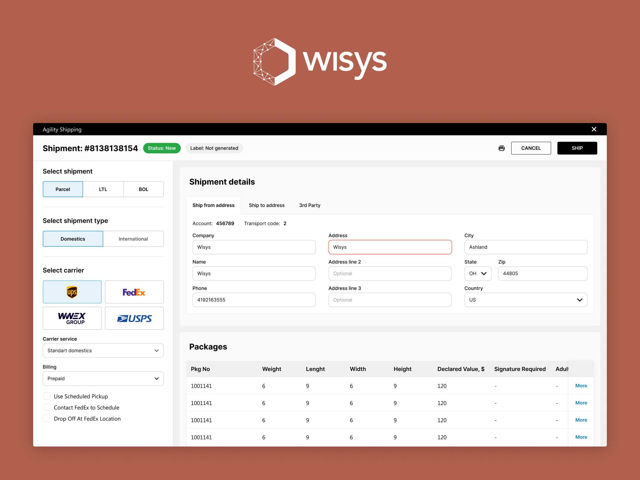
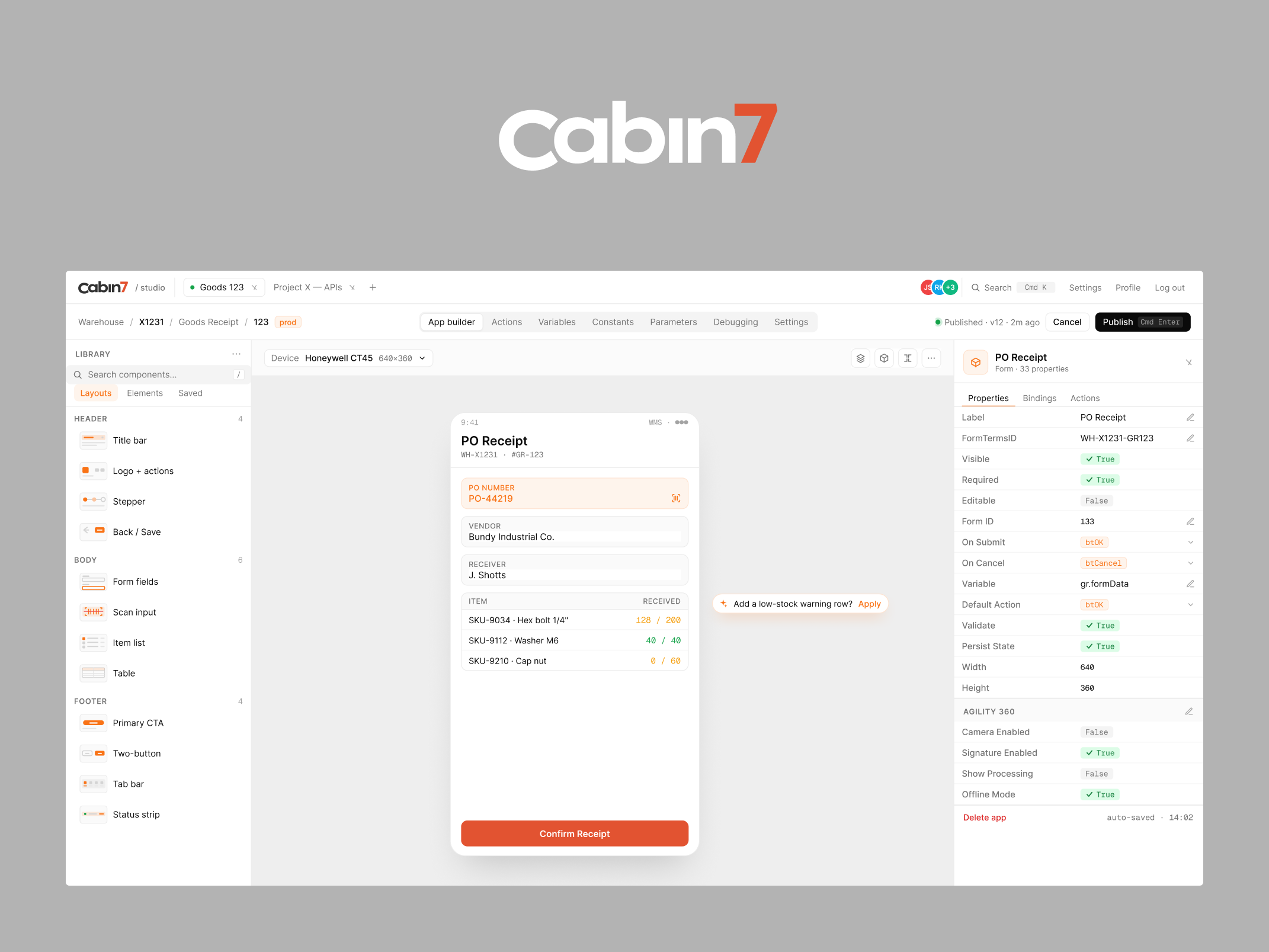
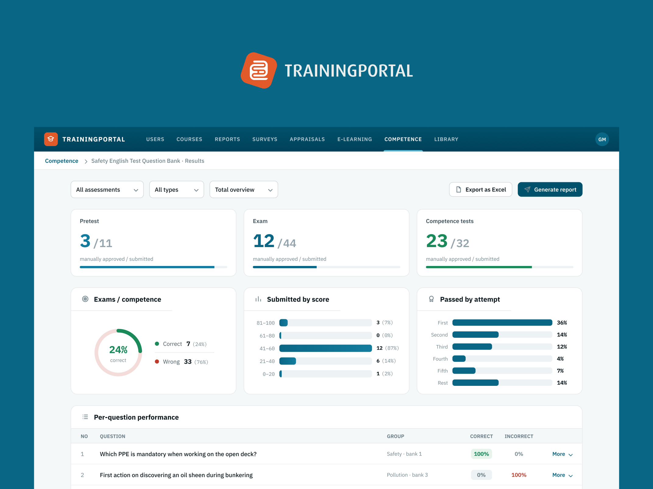
With data-heavy products, you usually end up in one of two places. Either you've got tables everywhere — dense, unreadable, requiring a spreadsheet mindset to navigate — or you've got dashboards full of graphs and charts that look impressive but mean very little to the person looking at them.
Both come from the same root cause: designing before you understand how people actually use the data. The interface becomes a representation of what's available in the database rather than a tool for making decisions. And those two things are very different.
Start with the decision, not the data
The starting point has to be testing, not visuals. Talk to users. Run A/B tests. Understand what decision they're trying to make and how much information they actually need to make it. What do they do with the data after they see it? What would they do if certain data wasn't there?
Only once you know that should you start adding the fancier elements — illustrations, emphasis, visual hierarchy — to highlight what matters. Skip that step and you end up with tables nobody can read and dashboards that exist mostly to look data-driven.
The goal isn't to show everything. It's to get someone immediate value the moment they land on the product, whatever industry you're in — finance, advisory, analytics, operations. Different context, same principle.
Different knowledge levels require different products
This gets significantly harder when your user base spans very different knowledge levels. A professional investor building portfolios and tracking companies all day needs something completely different from someone just getting curious about investing for the first time. The data might be identical. The interface needs to be entirely different.
Trying to serve both well from day one is genuinely difficult — you're essentially doing the research and design work twice, for two different mental models of what the product is for. The resulting compromises usually serve neither group particularly well.
Pick one persona and go deep
Early on, especially at zero-to-one stage, it's usually better to pick one or two personas, understand them deeply, and design specifically for them. What do they know already? What do they not know? What does a good day look like for them, and how does your product fit into it?
You can expand later as the product grows and the user base diversifies. Trying to cover every use case from the start usually means doing none of them particularly well. A product that works brilliantly for one type of user is a much stronger foundation than one that works adequately for five.
There's no shortcut here
There's no universal formula for data-heavy product design. Every domain has its own conventions, its own user expectations, its own tolerance for complexity. What works for a logistics dashboard won't work for a consumer finance app.
It comes down to testing, iterating, and actually understanding who you're designing for before you decide what to show them. The data is only as useful as the interface that surfaces it — and that interface is only as useful as the understanding behind it.
More writing

Book a 20-minute intro call
Slots show in your own time zone.
Let’s see if it’s a fit.
Twenty minutes is usually enough: the role, the product, and how your team works.


Ask AI about my work
AI answer, based on my case studies and CV
Answers show up here as they're written. I keep them short and point you to the case study they come from.
AI can get things wrong. If something matters, check the case study or email me at hi@gytismark.com.