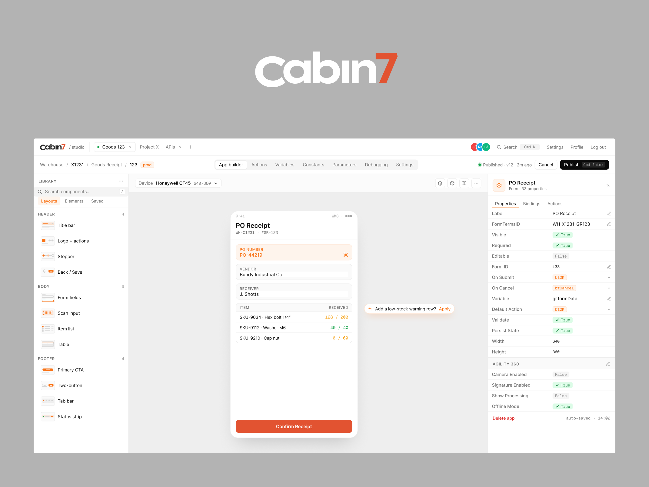
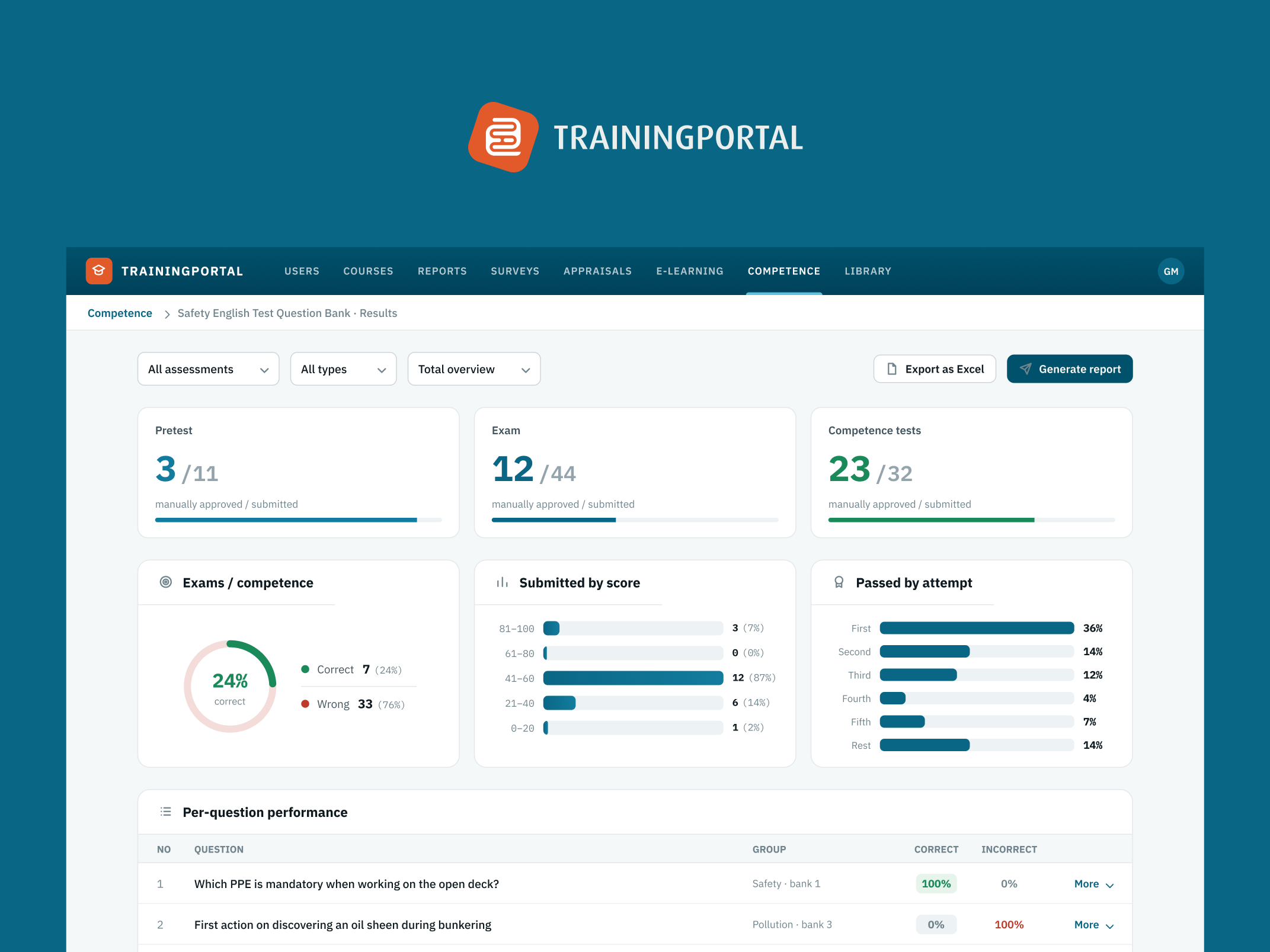
Dashboards aren't dying. Lazy dashboards are.
What agentic analytics actually changes for teams building data-heavy products

Every few weeks another analytics platform announces it's moving "beyond dashboards." Incorta was the latest, launching a decision-intelligence platform built around AI-driven actions rather than charts. Gartner reportedly expects 40% of enterprise applications to ship with task-specific AI agents by the end of 2026, up from under 5% a year earlier. And somewhere in every product team, someone is now asking the same question: should we replace our dashboards with a chat window?
I design data-heavy AI products for a living, so this question lands on my desk in some form almost every month. My answer tends to surprise people: the dashboard isn't dying. The lazy dashboard is. And the difference between the two is about to become the most important design decision in your product.
The lazy dashboard deserves to go
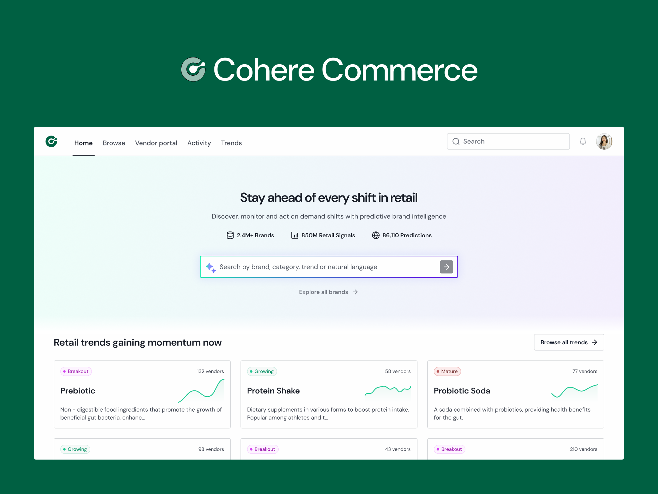
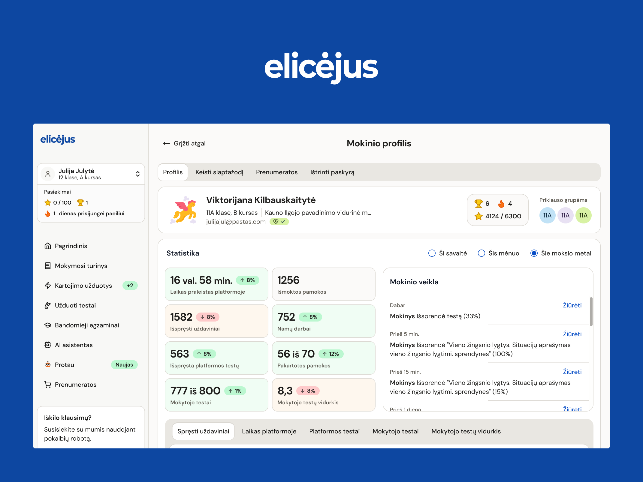
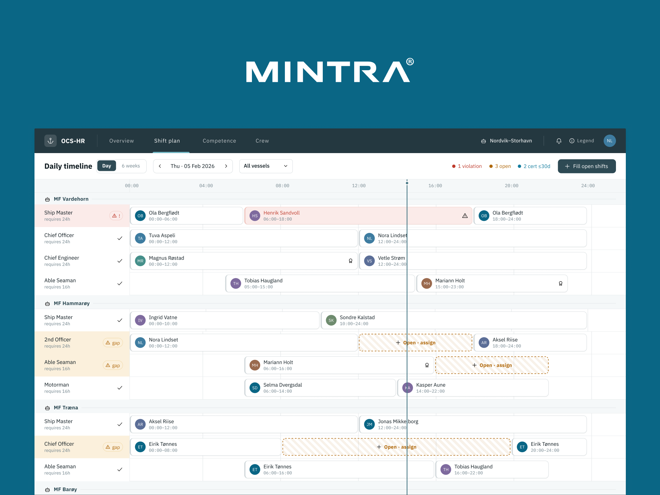
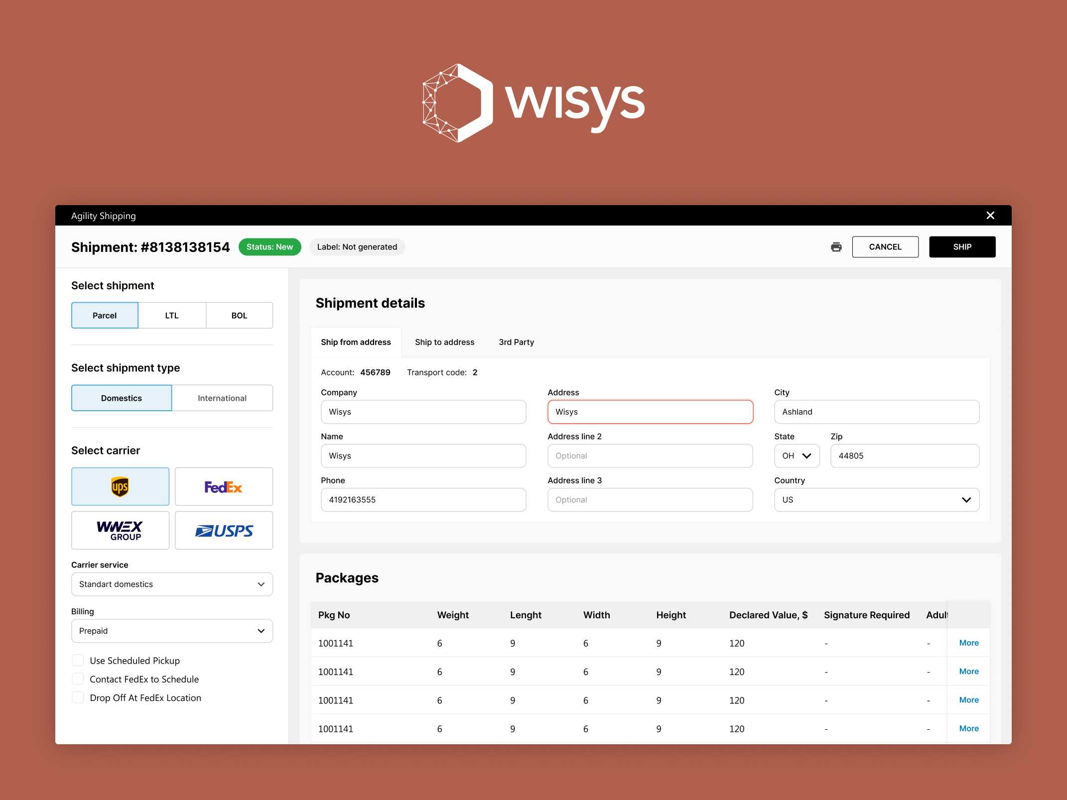
You know the one. Thirty charts on one screen, a filter bar nobody touches, and a general sense that the page exists mostly so nobody can say the data isn't available. It answers no specific question. It's a representation of what's in the database rather than a tool for making decisions — and those two things are very different.
I've written before about how data-heavy products confuse activity with insight. The lazy dashboard is that confusion given a permanent URL. It was built by asking "what data do we have?" instead of "what decision is the user trying to make?" — and for years it survived because there was no alternative. Pulling insight out of it was the user's unpaid job.
AI agents will happily take over that job. They'll scan the same data, flag the anomaly, and write the summary before anyone opens the page. For the wall-of-charts dashboard, that's an extinction event, and honestly, good riddance.
What changes when the system draws the conclusions
Here's where most teams get the next step wrong. If the agent can find the insight, the tempting conclusion is that the interface barely matters anymore — strip out the charts, ship a chat box, done.
My experience building these products points the opposite way. The moment a system starts drawing conclusions for the user, the interface has a much harder job, not an easier one.
Think about what actually happens when an agent tells a finance lead that revenue in one segment is drifting. The very first thing that person does is ask: based on what? Which data did it look at? What time range? Did it account for the pricing change we made last month? How confident is it? A human analyst would answer those questions in the hallway. Your interface now has to answer them on screen, immediately, or the user simply won't act on what the agent said.
Strip out the visual layer entirely and you get a black box wearing a chat window. It demos beautifully. Then it gives its first wrong answer — every probabilistic system eventually does — and if the user has no way to check the reasoning, trust doesn't dip. It collapses. I've watched adoption curves flatten at exactly that moment.
The chart becomes evidence
So the role of visualisation is changing, not disappearing. The chart is no longer the destination. It's the evidence.
In practice, that means the design work shifts to questions like these. When the agent makes a claim, what's the fastest visual that lets a human verify it — ideally in five seconds, without leaving the screen? What does the interface show about the data the agent considered: the scope, the time range, the sources? How does the product communicate confidence honestly, without hiding behind either false certainty or a wall of disclaimers? And when the user wants to go deeper, is there an escape hatch to the underlying data, or does the product just repeat itself more confidently?
None of this is chart decoration. It's closer to the work an editor does with a journalist: the claim goes up top, but the sourcing has to hold. Designing that sourcing layer — evidence a busy person can check at a glance — is harder than designing another bar chart, and it's quickly becoming the core of what data product design means.
There's a useful test I apply to every AI-driven data product I work on: find the moment the agent gives its first wrong answer, and look at what the user sees next. Whatever screen that is — that's the one deciding whether your product gets trusted or abandoned. It deserves more design attention than your homepage.
What this means for your roadmap
If your product shows data to users today, I'd suggest three honest questions before you bolt an agent onto it.
First, which specific decisions do your users make from your data? If you can't name them, an agent will automate your confusion, not resolve it — the discovery work has to come first, same as it always did.
Second, what will your user check when the agent is wrong? If the answer is "nothing, they'll just trust it," you don't have a product yet; you have a liability with a nice onboarding flow.
Third, who on your team owns this layer? It sits between data science and interface design, and in most teams it belongs to nobody — which is exactly why so many AI features ship as chat boxes. It's not that chat is the right pattern. It's that chat is the pattern you get when no one designed anything else.
The teams that get this right over the next year or two won't be the ones with the best model — models are commoditising by the week. They'll be the ones whose products make machine reasoning checkable by humans who are busy, sceptical, and one bad answer away from leaving. That's a design problem. It's the kind I like.
More writing

Book a 20-minute intro call
Slots show in your own time zone.
Let’s see if it’s a fit.
Twenty minutes is usually enough: the role, the product, and how your team works.


Ask AI about my work
AI answer, based on my case studies and CV
Answers show up here as they're written. I keep them short and point you to the case study they come from.
AI can get things wrong. If something matters, check the case study or email me at hi@gytismark.com.